Rob Minto

Sport, data, ideas

Page 20 of 39

Ponting’s captaincy

Just a quick post to say that in all the statistics mentioned around Ricky Ponting’s time as captain of Australia’s cricket team, the most telling was this, made by Mike Selvey in the Guardian:

[Steve] Waugh, during 57 Tests in his five years as captain, introduced just six debutants to the side, and one of those was the greatest wicketkeeper-batsman who ever lived. Ponting has been in charge for 78 matches and in that time 32 players have made their debut.

Good, strange and seasonal – the name game

The recent birth of my third child (a girl, all good, thanks for asking) meant another stab at picking a “good” name.

By good, I mean a name that ticks a few of these random boxes: not too popular; not too weird; sounds nice; no major associations; works with the other names we picked; doesn’t create a stupid acronym. That sort of thing.

And being something of a data nerd, I of course turned to the top list of baby names provided by the ONS. I’ve mentioned before the curiosity of names, and the readable analysis in freakenomics is fascinating.

However, a few things in the top girl names [xls file] (2009, the most recent list) struck me.

A quick test: our children are called Matilda, Francesca, and Annie. In 2009, the most recent data, which was the most popular? I would have thought Annie, but it was actually not even in the top 150, coming in at 153. Francesca was 98, Matilda at 46.

Weirdly, the names Lexi (47) and Lexie (69) – which count as separate names – when added together get into the top 30 with over 2,000 registrations. But the most notable thing about Lexi(e) is that it has risen from nowhere – in 1999 both variations barely got into the top 2,000 names.

But buried lower in the data was the confirmation that naming children can be terribly contrived. For nine months of the year, the most popular names are as you might expect. But then in June and July, Summer appears in the top 10. Overall in 2009, it ranked 24th with 2,054 girls given that name. But June and July saw 608 of those, nearly 30 per cent of the total. I’d guess it’s close to the top 10 for August too.

In December, it’s even worse. Holly, a name that over the year ranks 19th, is top in Christmas month, with nearly 23 per cent of its registrations, (519 of 2,263). It doesn’t get in the top 10 for any other month. Basically, if you meet someone called Holly, you have a 1 in 4 or so chance she was born in December.

Without wanting to sound too clever, I think we’ve picked good names. It’s a tricky dilemma, and you want to be creative without ending up like Daisy Waugh – Panda, Zeberdee and Bashe might be “different”, but it’s a fine line.

Finally, scrolling down to the very bottom of the list to the names given to only three girls nationally (names given only twice or less are redacted) throws up the truly awful. Porsche? Lilo? Topsy? There must be some corkers with only one entry.

When monochrome should rule

I was in a deli near work yesterday, and used my debit card to make the purchase. So far, so ordinary. But then something caught my eye. The payment machine was new, shiny, and had a colour screen.

Now that may not seem like a big deal, but what is the demand for colour screens in a device like this? Let’s think about a card payment machine.

– It doesn’t belong to anyone (unless the business owner also runs the till)
– There is no experiential upside – you don’t stop using it because of the interface
– It’s not a “loved” device, like a phone, mp3 player or tablet
– You enter a price (till operator) or a Pin (customer) – that’s it

So why the hell does that need a colour screen?

Is this the end of the monochrome world? Happily not. There are still a lot of basic screens around, in stereos, on the phone in front of me (a Cisco IP phone), on bus stops. There’s a lot of virtue in keeping things this way – these devices convey simple information and have no need of the advantages that colour screens can bring. But I wouldn’t be surprised if they start to change in the next round of upgrades – the march to colour screens feels inevitable.

However, there is one device that seems to be resolutely black and white: the Kindle (and obviously, it’s imitators). I don’t have one, but I like the fact that it started in black and white, and is staying that way. It has a certain old-school charm to it. Plus of course it helps hugely with battery life, which isn’t a concern for the things I mentioned earlier (desk phones, stereos etc).

Amazon don’t release Kindle sales figures, but they are clearly in the millions. This seems to me to be the last non-colour big product release.

And although reading text has a certain logic of staying black and white, television, you would think, has left that all far far behind.

Except according to BBC figures (p22) there are 24,000 black and white TV licences registered in 2009 – from over 200,000 only 10 years ago. It’s an astonishing decline, although I suspect it will be a long tail that could drift for years.

So who are the B&W TV holdouts? I can only think of one group of people for whom it makes sense: the blind. You can get 50 per cent off the licence anyway if you are blind, but half of the full price – £72 or so – is a lot more that £24, which is the half price for the B&W licence.

Except… try buying a black and white TV. I’m sure it’s do-able, but it’s not easy. Currys don’t sell them. Nor do Argos.

Will debranding cigarettes cut smoking?

Today, March 9, is national no-smoking day (in the UK). Coincidence or not, it has also been announced that tobacco displays will be banned in shops, with the further possibility that cigarettes could be sold in plain packets.

Will this debranding help cut smoking? Because that’s what we want to do, I assume. Without an outright ban on smoking, which is still seen as a step too far, making smoking harder to do and less attractive to buy is the next best thing.

Leaving aside the costs of removing tobacco displays and other marketing bits and bobs, is this helpful? To understand what’s going on, we need to look at what has happened to smoking rates in recent years. The most recent ONS data is from 2009. (See sources at the foot of this post).
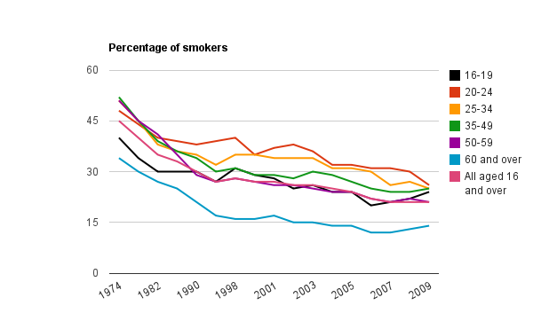
Basically, as seen in the chart above, it’s been on a downward curve, albeit one which has recently stalled. The downward curve is good news. The stall is not. Either the stall is temporary, or we have hit the ceiling (or floor, depending which way you look at it). The data is partial – 4 year intervals up to 2000, but you get the picture.

But dig deeper into the numbers, and you can see that, actually, people are still giving up smoking. All except one group: 16-19 year-olds. (Well, with a few blips here and there. There’s been a slight increase amongst the 60+ too.)
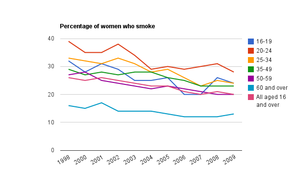
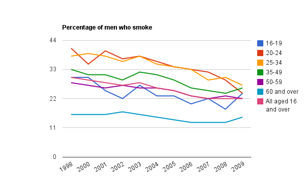
There was first a jump among women aged 16-19, and then the following year among men. (Trying to impress? Sounds familiar. Anyway…)

The uptake among 16-19 year-olds may be attributed to all sorts of things: rebellion, lack of education about smoking-related illnesses, doing the opposite of what your non-smoking parents do, fashion. Who knows? Even if you could ask every teenager in Britain, they would probably lie anyway*.

So: is debranding cigarettes a good idea?

FOR: teenagers are brand-aware, impressionable, and irrational. Removing tobacco imagery, with it’s intriguing logos and cool branding can only help. If you want to reduce smoking in the group where it’s on the increase, removing branding is a good move.

AGAINST: if there’s one thing that guarantees some level of intrigue and “cool”, putting things under the counter and in groovy plain brown paper is it. Teenagers will love the speak-easy status of cigarettes, the added bit of mystery. Brands aren’t really cool – teenagers are, and the whole no-logo thing will only help.

Sadly, I have no data to back any of that up. I’m sure there are tons of marketing studies that could prove it either way. The only measure will be whether smoking decreases or not, and as I mentioned before – statistics tell only what people are doing, not why.

Sources:

ONS: Smoking-related behaviour and attitudes

Results from the General LiFestyle Survey (GLF)

ONS: PDF – General Lifestyle Survey 2009 Overview, Table 1.1, p16

* I was a teenager once, and I lied about stuff.

Just “pub talk” – is it open season on the web?

A strange day for defamation and the internet. Jane Clift has lost her case against the Daily Mail – where she was trying to get the identities of two commenters on a Daily Mail article to sue them for defamation.

From Out-Law:

Mrs Justice Sharp said that Clift’s case was not strong enough to merit the identification, and that she should not have taken the comments as seriously as she did.

“It was fanciful to suggest that a sensible and reasonable reader would understand those comments as being anything more than ‘pub talk’,” she said in her ruling.

This raises a lot more questions than it answers. In no particular order:

* The Daily Mail has a massive audience of millions. I don’t know any pub that big. How is it not defamatory to post something libellous on a website? If the comments were not defamatory, then let her lose that case in a court of law.

* If the comments were not defamatory, then why has the Mail removed them?

* Is this open season for comments on websites? Do we all just need thicker skins? It’s not like Ms Clift wrote the article herself (or posted a video where someone wrote “this sucks” which happens all the time on YouTube) – she was the subject of an article which detailed a traumatic time in her life. Doesn’t she deserve better?

* Was this a case of Ms Clift looking like too much of a complainer? Slough council put her on some watch-list for complaining about a drunk, she then sued them (and won), and then has taken a legal case against the Mail – who wrote a favourable article about her in the first place. On paper, that looks like a lot of complaining. But then, what are you supposed to do? It’s like a Kafka-esque chain where one (legitimate) complaint has led to another, and to her life being totally up-ended. She’s using the courts, which is what they are there for.

As someone who works in publishing, it’s a ruling that is on one level a relief. Unless, of course, you’re the one being talked about.

The many names of Gaddafi

You can hardly miss the colonel who has run Libya for the last 42 years. But how do you spell his name?

Due to there being no formal way of translating his name from the Arabic, Col Gaddafi (FT spelling) has many viariants. This has been written about here, and lots of other places, but I thought I would take the time to try to quantify it.

Using ABC news‘s list of all the variants they could find, I removed the extraneous bits, and cut all the variants of “Muammar”, leaving just the Gaddafi bit. I then deduped the list. This whittled their 112 names down to 41. I then ran each name through Google, making sure to get the exact name and not one they were suggesting.

Here are the results:

Variant Google results
Gadhafi 104,000,000
Gaddafy 94,800,000
al-Qaddafi 27,200,000
al-Gaddafi 24,800,000
el-Gadhafi 11,900,000
Kaddafi 11,000,000
Gaddafi * 3,250,000
Kadhafi 3,070,000
Gadafi 1,770,000
Qaddafi 1,360,000
Gheddafi 1,010,000
Gadaffi 873,000
Kadafi 563,000
al-Kad’afi 387,000
Al-Kaddafi 339,000
al-Kadafi 332,000
Kad’afi 300,000
Khadafy 285,000
Qadhafi 231,000
Khaddafi 153,000
Ghaddafi 148,000
Ghadafi 113,000
Qadafi 96,800
Kadaffi 89,500
al-Qadhafi 85,900
al-Khaddafi 84,100
Khadaffy 80,500
Ghadaffi 61,400
Gadafy 57,300
Gathafi 47,900
Qathafi 44,900
al-Qadafi 30,300
Qadhdhafi 25,300
Al-Gathafi 23,300
Gaddhafi 16,600
Kazzafi 8,650
al-Qadhdhafi 6,580
Ghaddafy 5,480
Quathafi 4,070
Qudhafi 649
Qadthafi 199

* Most frequently suggested by Google

So there you have it. Gadhafi is the clear winner, with 104m. And yet it’s not the most frequently suggested by Google. That’s Gaddafi. Why?

Here’s another way of looking at the data with a Many eyes bubble chart. And here’s a bar chart. Basically, there’s one hell of a long tail.

Source: Google. Click to see full graphic.

China: the new home of the skyscraper

In my last post I talked about how London is getting a new clutch of 200m plus buildings. But then I thought – where are the biggest buildings around the world now?

In the past, New York was always regarded as the tall-building capital of the world, and held that reputation even though the Willis (formerly Sears) Tower in Chicago was the tallest building in the US. Hong Kong has always been a tall city, given the pressure on land space. And after that, a few smatterings of tall buildings in Asia held the world’s tallest title – the Petronas Towers in Kuala Lumpur, followed by Taipei 101.

Then came The Burj in Dubai – significanty bigger than anything else by some distance, at over 800m (Taipei 101 is around 500m).

And yet – the country that leads the way is China. A list of the top 100 tallest buildings in the world (completed, not in construction) shows that China has 32 – just shy of a third. Next is the US with 28. The UAE has 17. That leaves the rest of the world with only 22.

And the Chinese surge is amazing – 23 of China’s 32 were completed since 2000. As for New York, of its seven buildings in the list, four were built in the 1930s. That’s a bygone if golden age. Overall, 55 of the top 100 were built this side of 2000.

And where are the next clutch of buildings being built? India, Saudi Arabia, and of course, China. Three of the top five buildings under construction are in China, and it has five buildings under construction that will top out at over 500m.

Every so often China takes over something as the world’s most or biggest: most internet users, overtaking Japan as the second biggest economy (read Gavyn Davies for the best analysis of the economy issue). In skyscrapers, China may not have the tallest, or even the most iconic, but in sheer volume it leads the way.

London – the new monolithia

The London skyline is rapidly changing. This is obvious, and has been much-written about. Since the 2008-09 hiatus in construction due to the credit crunch, building big is back on.

UPDATE: would be remiss of me to not mention the FT’s excellent Shard of glass construction multimedia extravaganza.

But although a few buildings with catchy names are well-known, what is remarkable is just how many buildings over 200m are being built, and how few there are currently.

The problem is that many of these buildings are pretty uninspiring. For every Shard or Gherkin, there are several bland towers. Here’s a list (it’s a Google doc) and here is an excellent diagram-based list.

Of the nine 200m plus buildings listed above in London, only one is built – One Canada Square in Canary Wharf. The rest are all in construction, or about to be. The cranes are going up.

Of the 26 150m plus buildings, only two were built earlier than 2000 – again, One Canada Square and Tower 42.

What does this mean? London is not about to join the list of mega-skyscraper cities, where Hong Kong, New York and others are way ahead in terms of height and number. But this is a changing of a city.

Big buildings have impact – both in terms of inspiring residents and attracting tourists, but also in the gusts of wind around their base, the anonymous and impersonal nature of their function, and the sense of detatchment they can create.

London is a modern city which competes with New York, HK, Singapore and others on the world stage. But it did so successfully without building up up up. Is there a need now?

London is often described as a city of villages. It is becoming a city of mid-sized but imposing skyscrapers. I’m not sure it is any the better for that. Welcome to London – the new monolithia.

Djokovic and the multiple slam winners [UPDATED]

With Novak Djokovic winning in Australia, most of the coverage has focused on Andy Murray coming up short in his 3rd slam final (a damning stat – 3 finals, 0 sets won).

I thought I would concentrate on Djokovic instead. Djokovic has now won 2 of his 4 slam finals, which is not bad in the scheme of things. Amongst current players, only Federer (16-6), Nadal (9-2) and Del Potro (1-0) are in better shape. Hewitt is the same (2-2), there’s Ferrero on 1-1, while Roddick (1-4) had the misfortune of coming up against Federer in his prime 4 times.

For Murray, the only other multiple slam loser currently is Soderling with 0-2. The 1-time finalists I won’t list here.

However – one facet of Djokovic’s win is that it moves him from the one-time winner list to multiple winners, and does the Australian Open a favour at the same time.

The mark of a great player is winning more than one slam, ideally at more than one venue. Single slam winners are one-offs. They devalue the currency of the slam win, and don’t foster the key element to tennis’ popularity – rivalries. Continue reading

Premature obituaries – a closer look at the data

After being alerted by Paul Bradshaw’s tweet that Wikipedia has a fascinating list of people who have had their obituary published erroneously or prematurely, I thought i would take a closer look at the data.

First off, the caveats: it’s Wikipedia. Trust with care. The list is subjective, west-orientated and certainly incomplete.

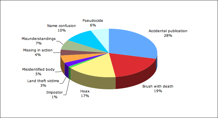
However, it is fascinating. The headline is that there are far fewer hoaxes and pseudocides then you would think. Most premature obits are basic errors, human and mechanical. News agencies report rumours as facts, other news outlets repeat. And although we might think this is getting worse and worse in the blog-twitter-newswebsite world, it’s not really – this is as old as the hills. There are incidents dating back centuries.

Out of the 180 incidents, faking death and hoaxes accounts for only 41 cases, while accidents and misunderstandings together are just shy of 50 per cent.

The full data is here in a google document.

Accidental publication 52
Brush with death 34
Hoax 30
Impostor 2
Land theft victims 5
Misidentified body 9
Missing in action 7
Misunderstandings 12
Name confusion 18
Pseudocide 11
total 180
« Older posts Newer posts »

© 2025 Rob Minto

Theme by Anders NorenUp ↑