Rob Minto

Sport, data, ideas

Category: Best (page 1 of 2)

The 10 best sports graphics and data visualisations of 2016

It’s year-end journalism time! My non-scientific round up for 2016 of the best sports graphics… drum roll please.

THE WINNERS (I couldn’t decide between them)

The Sumo Matchup Centuries In The Making
By Benjamin Morris
Publisher: FiveThirtyEight
A beautiful history of Sumo wrestling. Stunning photos, great charts – this is a model of modern data journalism coupled with great writing and presentation.

The NFL Draft
By Tim Meko, Denise Lu, Bonnie Berkowitz and Lazaro Gamio
Publisher: Washington Post
The NFL draft is a whole sport in itself: some teams play it far better than others. The WashPo nails a mix of interactivity, user input (pick your team), long-scrolling with story-telling to amazing effect. It’s not a “beautiful” graphic, but instead a whole application delivered brilliantly. Quite amazing.

AND EIGHT GREAT OTHERS

Premier League 2015-16 – the story of the season
By Neil Richards
Publisher / Platform: Tableau
Not mobile-friendly, but a great way to replay the 2014-15 season. Interactivity that’s integral rather than gimmicky. And it even has managerial sackings!
Notable mention: see also the FT’s rise of Leicester.

Perfect, Freaky Olympic Bodies
By Joshua Robinson, Paolo Uggetti, Siemond Chan and Mike Sudal
Publisher: Wall Street Journal
One of a great crop of Olympic graphics this year, this had no interactivity at all – just a very arresting set of images delivered with great style, looking at some extreme types of Olympic physique.

How Nafissatou Thiam beat the odds to claim the heptathlon gold in Rio
By Niko Kommenda, Apple Chan Fardel and Monica Ulmanu
Publisher: The Guardian
A lovely interactive graphic, coupled with photos and a great story to show how the heptathlon was won. Thiam needed the performance of a lifetime to steal the crown from the favourite. A good example of clean graphics enhance what would otherwise have been a great story in any case.

A visual history of women’s tennis
By John Burn-Murdoch
Publisher: Financial Times
This is how to do sports history. Brilliant. (Disclaimer: I’m a colleague and friend. But this is really good).
Notable mention: The LA Times on Serena Williams – a visual tour of her greatness.

Every shot Kobe Bryant ever took. All 30,699 of them
By Joe Fox, Ryan Menezes and Armand Emamdjomeh
Publisher: LA Times
Weirdly compelling, slightly unnecessary but fantastic all the same. Title says it all.
See also: Stephen Curry’s 3-Point Record in Context by the NYTimes

The current All Blacks are the most dominant rugby side ever. Why?
By James Tozer
Publisher: The Economist
Not visually arresting like others in this list, but a great statistical take on the All Blacks’ rugby dominance, and it has one chart that says it all.

A Visual History of Which Countries Have Dominated the Summer Olympics
By Gregor Aisch and Larry Buchanan
Publisher: New York Times
No list would be complete without something from the NYT, and this is a great visual history. Charts that you will just love. Brilliant. See also: the interactive medal chart. Accept no others.

There were some other great NYT graphics on Phelps and sprinting, for instance. But sticking with my rule of one per publisher, the last-but-not-least spot goes to…

Most Unlikely Comebacks: Using Historical Data To Rank Statistically Improbable Wins (in the NBA)
Publisher: Polygraph
This is just so well done, I love it. I just think you should see it.

So there it is folks. The best of 2016, completely subjective, as compiled by me. You may have your own favourites that I’ve missed, so please add in the comments. But there’s nothing at stake here, just great data journalism to enjoy.

Winners will (probably) get a copy of my book – I know, I know. But it is worth a read.

Euro 2016: survival of the weak

euro numbersThe Euros start today. And go on for a bit, and a bit longer, and then eventually there will be a final, I promise.

If you feel that there’s something not quite right about this edition of the quadrennial, you’d be spot on. It comes down to the numbers.

In previous editions, the Euros were contested by 16 teams. Four groups of four, top two go to the quarter finals and so on. Great. But this edition is 24 teams.

Let’s take a step back: how did we get to 24 teams?

Well, it started with 53 teams, divided into nine groups of six (and one of 5). In those groups, the top two went through, plus a third place team, and then the other eight third place teams had a playoff.

From 53 to 23 (plus the hosts) isn’t much of a cut off. To compare, the World Cup for 2018 goes from 210 to 31 teams, and the UEFA (ie European) part of that goes from 54 teams to just 13 (plus Russia as hosts).

So rather than eliminate 76 per cent of the European teams in qualifying, as the World Cup does (the overall rate is 85 per cent), the Euros eliminated just 57 per cent of the teams in qualifying.

That basically means you can be a very average team and still get through to the finals. Obviously, not the Netherlands, but that’s another story.

And then there’s the finals themselves. The Guardian have done it brilliantly: a tournament of 24 is a terrible number. To get to the knock out stages of 16 teams (rather than 8 as before), you are eliminating not half, but just a third of teams from the group stage.

In other words – 53 goes to 23 (plus host), 24 goes to 16, then it’s a knockout (with some severely complicated rules along the way).

It’s almost harder to fail than it is to progress.


PSG: liberty, fraternity, inequality

473809032Sport is inherently unequal. Talent and skills are not distributed fairly, and it would be a far more boring world if they were.
But when it comes to the wages that are paid to players, some leagues prefer a fairer system – especially in the US – and some are content with a less equal system. Some are downright ridiculous.

The data provided each year by Sporting Intelligence highlights the haves and have-nots by comparing average team wages in 333 teams across many major leagues. As ever, the American sports leagues are notable by their evenness. In the NFL, for example, the top paying team, the Miami Dolphins, pay an average annual salary of £1.37m per player. The lowest payers are the New York Jets, with £1.01m per player. That’s across 32 teams. The difference top to bottom is just £357,000.

Let’s look at some of the major European football leagues by way of comparison. The contrast and variation is astonishing. Continue reading

2 strange things about the Boat Race

142583116

The Boat Race is a bizarre event in many ways. The course is incredibly winding and gives a potentially huge advantage to the crew on the Surrey station (the south side). It’s elitist. The participants are typically now international rowers rather than amateur undergraduates. It’s way longer (over 4 miles) than usual rowing races (2k).

But there are two other odd things going on.

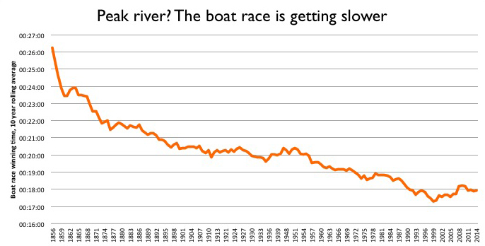
1) The race is getting slower

For many years, as boat technology improved and crews trained harder and smarter, and the rowers became international pros, the winning time came down. From the 1950s to 2000, typical times went from around 20 minutes to 17. The course record was set in 1998, at 16:19 by Cambridge. From 1996 to 2005, 5 of the 10 winning times were sub-17 seconds.

But since 2005, there have been none below the 17 second mark. As the chart below of the rolling 10-year average shows, since 1999 the times are getting slower. (I’ve used the 10-year average to smooth out what is otherwise a very bumpy chart, and show the trend. The average also mitigates the impact of the bad-weather years.)

boat race 10 year rolling average winning time

Why the drop in pace? It’s hard to say for sure. My guess is that technological and fitness improvements are now very incremental. The shift to a global talent pool happened a while back. Instead, the races are tight, with clashing oars and cat-and-mouse tactics. It’s all about winning, not the clock.

This leads to the second odd thing:

2) The reserve crews are frequently quicker

Obviously, you would expect the Blue crew to beat the reserves (Goldie of Cambridge, Isis of Oxford). But some years the reserves, who race just before the Blues, are quicker. In fact, in seven of the last 18 years, the reserve crews have registered a faster time. The average gap between the winning times is also narrowing.

blue vs reserve

This suggests that there is a deeper pool of talent available to both teams. But it also backs up the idea that the Blue race is all about winning.


How far can cricket’s one-day record go?

The cricket World Cup usually has a pretty dull round of opening matches, but Chris Gayle has done his bit to keep things interesting. His (World Cup record) knock of 215 has been rightly praised and analysed – I won’t go into detail here.

However, it is not the highest One-Day International score ever. And recent cricket records show that 200-plus scores could soon be more common.

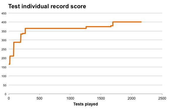
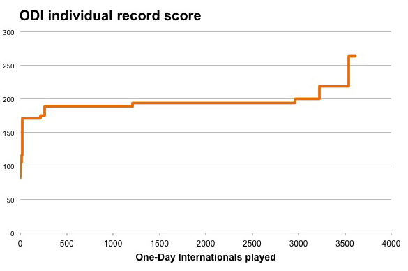
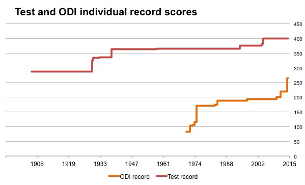
Below are the progressive records for the highest Test innings, and highest One-day score.

If we look at the ODI highest-innings record, it charts an interesting course. Unlike the equivalent Test record, which quickly got to over 300 in the 193rd Test in 1930, and then nudged up to 400 over the next 1,500 matches, the ODI record shows the new, go-for-broke batting style of the last few years.

The charts below show the record not by years, but by international matches played. This is a better gauge than the date when the innings was made, as the frequency of cricket matches has accelerated over the years. (Just to illustrate: there were 266 tests played in the 1980s, compared to 420 in the last 10 years. Equally, there were 516 ODIs in the 1980s, compared to 1,385 played in the last 10 years. I have not included the T20 record as it is still early days in that format, internationally at least.)

test indiv record

ODI indiv record

The ODI record starts up towards 200 runs over the first 300 matches or so, and then tails off. Viv Richards’ record of 189 stood from 1984 to 1997, for just under 950 ODIs. Then Saeed Anwar’s record of 194 was the top score from 1997 to 2009, covering over 1,600 ODIs.

But in the last 500 ODIs or so, the record has been pushed over 200 and quickly towards 300.

This is a reflection of new rules – the power plays which restrict fielders on the boundary, as well as a new breed of batsmen who play far more T20 cricket and have pushed the style of the one day format. Players such as Chris Gayle, in fact.

This seems counter-intuitive. The ODI match is restricted to 300 deliveries, whereas the only limit to a test innings is time. However, the Test record has stalled – partly as teams are now keener to push for victories rather than indulge a player who might rack up a huge score, which can often lead to a draw.

So how far can the ODI record go?

Theoretically, a player who hit every ball for 6, except the last ball of the over which is hit for 3 (so he can retain the strike next over) could score 1,653. However, a million ODIs could be played without that happening. More realistically, a player could face around 200 of the deliveries bowled – the current record of 264 by India’s Rohit Sharma was scored in 173 deliveries; the 1975 record of 171 by New Zealander Glenn Turner took 201 balls. If we took Sharma’s strike rate of 1.53 and applied it to 200 balls, that would be a score of 306.

However, a look at the ODI scores of 150-plus shows that higher strike rates are possible. Shane Watson of Australia hit 185 in just 96 balls in 2011. If we applied his strike rate of 1.92 runs per ball to an innings of 200 deliveries, that would result in a score of 380 or so. If we take into account the strike rate of the quickest ODI century – the recent record of just 31 balls was set by South Africa’s AB de Villiers hitting at over 3 runs per ball –  could 400 be feasible?

For that to happen, a lot of things would need to go right: short boundaries; a player of supreme power in luck and in form; poor bowling; and two in three deliveries to that one player. That’s a lot to ask, but the two individual elements (strike rate, number of deliveries) have both been achieved before, so this is not an impossible scenario.

We might even end up with a seemingly unthinkable situation: the ODI innings record higher than the Test mark. Still, a long way to go, as the chart below shows.

test and odi record

Forget Harry and Amelia – we are naming our kids with more variation than ever

I have a big interest in this one: I am about to be a father for the 4th time. Finding a name is tough when you’ve used up a whole bunch already, and you have to avoid clashes with friends and family with similarly-aged children.

So the Office of National Statistics baby names for 2012 – released on Monday – is a data treasure trove. What’s up, what’s down, what to avoid.

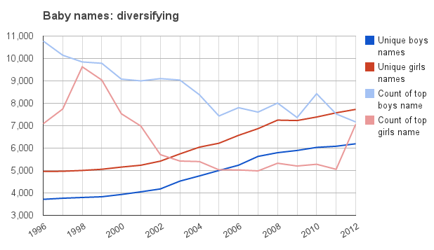
But in all the hoopla over the top names (Harry and Amelia), there is an important trend playing out. In the UK, we are getting far more diverse in how we name our kids.

There are several ways to measure this, using the ONS data that goes back to 1996.

One is to look at the number of babies that are given the top name. From a peak of nearly 11,000 for boys in 1996 (the first year of available data) and 9,600 for girls in 1998, the top name has dropped to around 7,000 for boys, and until 2012, around 5,000 for girls. Ameila, the top name in 2012, has bucked the trend, with around 7,000.

But does that mean that we are simply spreading names out further among the favourites? It seems not. The ONS also lists all names that are given to three or more children in each year. The pool of names that aren’t so weird or odd as to be completely unique is rising, from under 4,000 for boys in 1996 to over 6,000 now; and under 5,000 for girls to nearly 8,000 in the same period.

(The Independent reported that there were 28,000 different boys’ names and over 36,000 different girls’ names in 2012 – which means there are a HUGE mass of names that aren’t listed by ONS which have just one or two occurences. Roughly 28,000 names have one or two occurences – out of 350,000 births, that’s a lot. But I’ve worked from the ONS dataset which gives three or more instances of each name.)

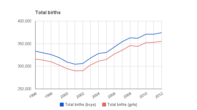
That could be partially explained by simply more overall births – and after a drop to 2002, the birth rate has indeed picked up.

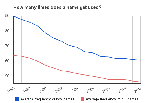
But we can easily factor that in: the average frequency of names for both boys and girls (ie the total births divided by the number of unique names used 3 or more times) is going down consistently over the period.

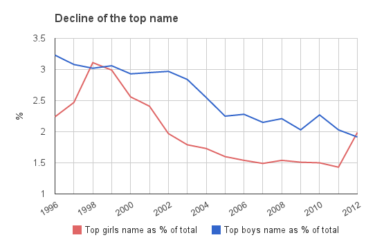
Equally, we can look at the number of times the top name is used as a percentage of the total births for boys and girls – and this is also heading down, with over 3 per cent of boys being given the top name in 1996, to under 2 per cent now. The girls top name has fluctuated more, but the trend is similar.

The divergence between the results for girls and boys shows that we have always been more creative with girls names – but the diversification trend is happening for both genders.

Why is this happening?

One answer may be immigration. As the UK gets more people from other countries, so it will get a greater diversity of names. This explains the higher number of unique names.

But that doesn’t explain the rapid decline in the number of times the top name is used. That implies we are getting more creative.

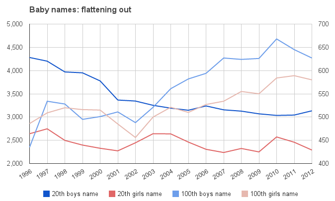
And in fact, if we look at the number of times the 20th name is given, and the 100th, there is an interesting pattern. For both girls and boys, the 20th name is also declining in popularity, but not as dramatically as for the top name. But the 100th name is generally getting more popular over time. That implies we are searching for more interesting names – the 100th most popular name is not exactly mainstream.

How far can this go? For boys, a lot further, clearly, as boys names lag behind girls in terms of diversity. Overall, there may be no end to it. You can imagine almost limitless variations on some names, as well as ever more exotic places and made-up names. Then there are hypenated versions: there were 19 Lilly-somethings alone last year. And there are parents perhaps trying to get their kids noticed by alphabetical means – there are 69 girls names in the 2012 data that start with two As, compared to 17 in 1996. And there were 125 girls names starting with Z in 2012 – compared to 74 in 1996.

Parents want their kids to stand out, it seems.

Data for all charts from ONS

The Getty watermark is a stroke of genius. Here’s why.

I had an article in today’s FT (June 1, 2012) on Getty Images watermark (Getty shifts with new stamp of ownership), but in the interests of journalistic fairness, I couldn’t say exactly what I thought. So here’s what I think.

In brief: the company has changed the watermark from an obstructive, possessive gesture to a helpful, open one. It is not longer a simple stamp across the image, but a cleaner box with a short-form URL and a photographer credit.

It’s a stroke of genius, in my view. Why? Well, there are several reasons I can see. In no particular order: Continue reading

Why Gmail’s new look is a usability nightmare

I am absolutely furious with Google’s changes to gmail. I don’t really care about the design. The themes allow you enough scope to personalise. The problem is a technical one that has screwed up usability. It’s fundamental, and is the use of multiple iFrames.

What these iFrames do is create scrollbars within scrollbars, especially if you use labels and gadgets in your gmail (which I do).

Gadgets are used to be an easy way of seeing other things like your calendar or Google docs without leaving your email – a nifty productivity bonus. Labels are pretty fundamental to using gmail. Now they have become a nightmare. Continue reading

How Georgia rules the newspaper web fonts

What have the Guardian, Times, Telegraph, FT and Independent got in common (aside from being UK newspapers)? Politically? Not much. Ownership? Couldn’t be more different. Style? Now you are getting somewhere.

If you’ve ever surfed a few news websites and had a sense of deja vu, that’s because you have seen it before. All the papers listed above use Georgia as their main headline font – and most use it for the text as well.

While print editions of newspapers try their best to look different, it seems all broadsheet or quality press outfits online look the same. Georgia everywhere. It’s true of my employer, the FT, which has adopted the font in its last redesign, and it’s true of most US papers too.

Interestingly, the tabloid press are keener on Arial and other sans-serif (ie non-twiddly) fonts.

So why are the newspaper sites gravitating to one font? Georgia is a classy font, but why is it the be-all and end-all?

One reason is web standards. If you want a consistent look for your site, you have to use a font that is compatible with all browsers and devices, so you can be sure of your how it renders, and Georgia (along with Arial and a few others) is one of those ‘base’ fonts.

But this is crazy. In this web environment, you can pick any font using css (stylesheets) and tell the browser what to do if it doesn’t recognise that font. It’s just a list – you could start with something exotic, and then put Georgia as the backup. I’m baffled as to why sites don’t do this. The spacing issue isn’t an issue, as headlines change in length all the time. You can even specify different stylesheets for different devices if you need. The world has moved on, but we are retreating to a handful of fonts.

And before you point it out, yes, I’ve used Georgia as the font for this blog. I just like it, but maybe that’s the reason – it’s just really really good. In which case, hats off to Matthew Carter, who invented it (along with loads of other fonts.)

Here’s a quick rundown (not comprehensive) of who is using which font:

Georgia (for headlines at least):
– Guardian
– Independent
– FT
– The Times
– Telegraph
– Wall Street Journal
– International Herald Tribune
– NYTimes
– LA Times
– Washington Post
– New Statesman
– Time – Georgia and Arial mixed

Arial:
– Daily Mail
– USA Today
– The Onion
– Reuters and Bloomberg use Arial in their sites (Bloomberg uses a Georgia derivative in its terminals)

Economist uses Verdana. Good for the Economist. A bit different.

The gender timebomb of India and China: a stab at the numbers

When I visited India in 2003, I was shocked by areas of the countryside where there seemed to be not a young girl in sight. It was all boys, as far as you could see.

When we asked our tour guide about the lack of girls, he scoffed at any suggestion of infanticide or selective abortion. Instead, he told us that women could conceive a boy if they slept on a particular side of their body just after intercourse.

This was a man with a degree, a full education and seemingly worldly-wise. He surely couldn’t believe the old-wives tosh, and was just peddling nonsense to avoid reality.

But the population time-bomb in India and China is soon going to be upon us. China pursued a one-child policy that has skewed a generation towards males. India’s gender imbalance is cultural rather than state-imposed, but has a similar effect.

Take India. If the 917 girls to 1000 boys ratio is correct, that means by 2020, we are looking at over 25m (and probably closer to 35m) shortfall in girls to boys in a 15 year generation.

The back-of-envelope maths:
There are 100m plus children aged 0-4. Multiply by 3 for a 15-year generation. 300m * (1-0.914) = 25.4m

In other words, there are going to be, in all likelihood, over 20m young men in India who have no chance of finding a partner.

In China, it’s around the same scale – over 20m young men left out of the dating game. The population data used in the CIA Factbook bears this out:

0-14 years Male Female Difference
India 187,450,635 165,415,758 22,034,877
China 126,634,384 108,463,142 18,171,242

In a generation, we are going to have over 40 million enforced bachelors in India and China. What does this mean for these societies? There are several trends we can expect, as outlined in Bare Branches:

high male-to-female ratios often trigger domestic and international violence. Most violent crime is committed by young unmarried males who lack stable social bonds. Although there is not always a direct cause-and-effect relationship, these surplus men often play a crucial role in making violence prevalent within society. Governments sometimes respond to this problem by enlisting young surplus males in military campaigns and high-risk public works projects. Countries with high male-to-female ratios also tend to develop authoritarian political systems.

In other words:
– rising crime in sex trafficking and prostitution
– social bonds weaken
– riots and disillusionment
– authoritarian crackdown
– high military enrollment

Not a wildly happy future. All those who see India and China as a one-way bet should perhaps think again.

Further reading:

BBC:India’s unwanted girls
Economist: The worldwide war on baby girls
Economist: China’s population – The most surprising demographic crisis
UNFPA: Sex-Ratio Imbalance in Asia: Trends, Consequences and Policy Responses

UPDATE: The economist has a great chart on China’s population and the impact of the one-child policy.

Older posts

© 2024 Rob Minto

Theme by Anders NorenUp ↑