Rob Minto

Sport, data, ideas

Category: Ideas (page 2 of 3)

2 strange things about the Boat Race

142583116

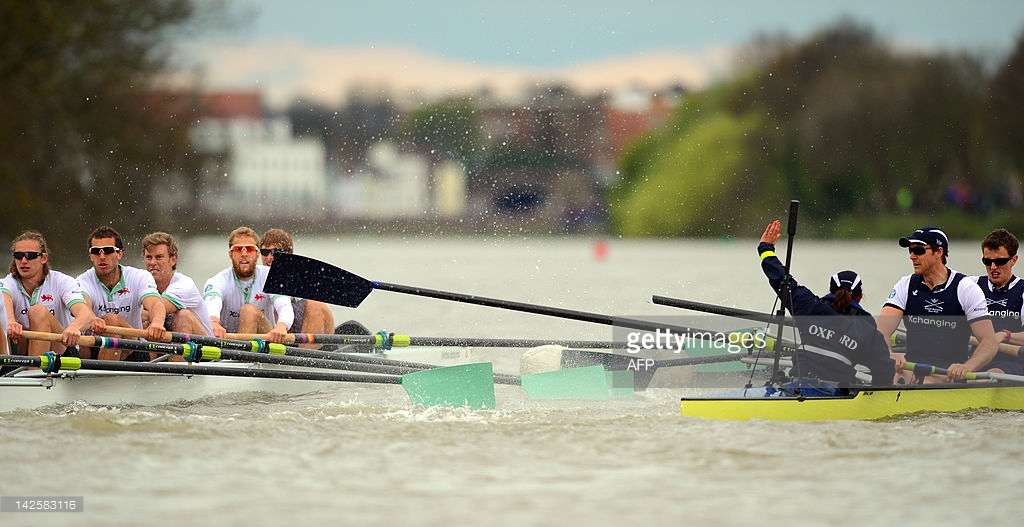
The Boat Race is a bizarre event in many ways. The course is incredibly winding and gives a potentially huge advantage to the crew on the Surrey station (the south side). It’s elitist. The participants are typically now international rowers rather than amateur undergraduates. It’s way longer (over 4 miles) than usual rowing races (2k).

But there are two other odd things going on.

1) The race is getting slower

For many years, as boat technology improved and crews trained harder and smarter, and the rowers became international pros, the winning time came down. From the 1950s to 2000, typical times went from around 20 minutes to 17. The course record was set in 1998, at 16:19 by Cambridge. From 1996 to 2005, 5 of the 10 winning times were sub-17 seconds.

But since 2005, there have been none below the 17 second mark. As the chart below of the rolling 10-year average shows, since 1999 the times are getting slower. (I’ve used the 10-year average to smooth out what is otherwise a very bumpy chart, and show the trend. The average also mitigates the impact of the bad-weather years.)

boat race 10 year rolling average winning time

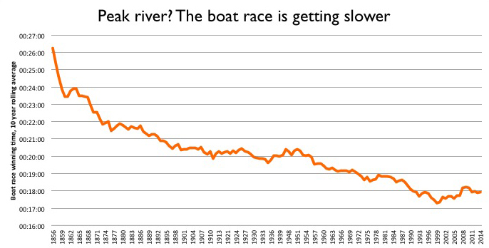
Why the drop in pace? It’s hard to say for sure. My guess is that technological and fitness improvements are now very incremental. The shift to a global talent pool happened a while back. Instead, the races are tight, with clashing oars and cat-and-mouse tactics. It’s all about winning, not the clock.

This leads to the second odd thing:

2) The reserve crews are frequently quicker

Obviously, you would expect the Blue crew to beat the reserves (Goldie of Cambridge, Isis of Oxford). But some years the reserves, who race just before the Blues, are quicker. In fact, in seven of the last 18 years, the reserve crews have registered a faster time. The average gap between the winning times is also narrowing.

blue vs reserve

This suggests that there is a deeper pool of talent available to both teams. But it also backs up the idea that the Blue race is all about winning.


5 reasons why the word ‘phablet’ won’t catch on

Journalists and analysts love a new word. The current favourite is “phablet”, used to describe the new larger-sized smartphones that are nearly tablet-sized, but still a phone.

It’s a ghastly word, but don’t worry – it won’t catch on, despite the pick up in interest (see chart below). Here’s my theory why:

1) “smartphone” hasn’t caught on as a phrase

Smartphone is used in the industry to distinguish between the newer, touchscreen devices and older models termed feature phones that look like this (remember these?). It’s used all the time in articles and research.

But not in common language. No-one says “hey, have you seen my smartphone?” People still talk about their mobile. Or their phone. Because smartphone is both clumsy to say, and sounds pompous.

2) nobody cares about these distinctions in other areas

Like smartphone vs feature phone, we have laptop, netbook, PC – all industry distinctions. People just refer to their computer. And as we move to a world of uniform touchscreens, the only decisions people will care about are the cost, the operating system (Apple vs Android vs maybe Windows), and the size.

3) portmanteau words might be catchy, but don’t often work

Grexit? It’s had it’s day (see chart below). Descriptive words like “onesie” are much better.

4) people prefer to talk about brands

Seen my Kindle? Pass me the iPad?

and the biggest reason of all: 5) your mobile is not your device, it’s your number

Whatever device people call you on, that’s your mobile. As Christopher Mims pointed out on Quartz, we use these things less and less for calls – as little as 10% – but that doesn’t mean phone calls are completely dead. We still need to make and receive calls. And if you are sharing your contact details, no-one will ever ask for your “phablet” number – just as no-one asks for your “smartphone” number. They will ask for your mobile number.

Because you move your number across devices – I’ve had the same number for over 8 phones now, I reckon. Whether I have a phablet, a smartphone, or a something else, when it rings, I’ll answer it – and I’m on my mobile.

Charts:

The Getty watermark is a stroke of genius. Here’s why.

I had an article in today’s FT (June 1, 2012) on Getty Images watermark (Getty shifts with new stamp of ownership), but in the interests of journalistic fairness, I couldn’t say exactly what I thought. So here’s what I think.

In brief: the company has changed the watermark from an obstructive, possessive gesture to a helpful, open one. It is not longer a simple stamp across the image, but a cleaner box with a short-form URL and a photographer credit.

It’s a stroke of genius, in my view. Why? Well, there are several reasons I can see. In no particular order: Continue reading

John Terry vs Chris Huhne, Fred Goodwin vs Johann Hari: why it pays to wait

I can’t help thinking about four recent falls from grace. In essence, two are about awards, the other two about pre-emptive punishment. In all cases, we could benefit from being less hasty. I’ll explain why.

Let’s start with pre-emptive punishment. John Terry was stripped of the England captaincy while pending an investigation over racist abuse. Chris Huhne quit the cabinet following charges over his wife taking speeding points for him.

In these cases, the alleged crimes are totally different, but the principle is the same. Should someone step down from high office (the cabinet, the captain of English football) before their case is heard? And in both instances, the MP and player can remain just that. Why not go further – if they are not acceptable to lead the team, should they even be in it? If Huhne is not fit for cabinet, should he represent his constituents in Parliament?

Yet it was over the Terry case, the more morally worrisome and noxious case, and over an individual with prior bad behaviour (violence, infidelity), that Fabio Capello, England manager resigned. Capello said it was unfair to pre-judge the case. And surely, he has a point? If Terry is innocent, will the FA give him back the captaincy? About as likely as Capello managing England again.

Terry may be an odious person, certainly. But this is all the more reason to not give him the captaincy in the first place.

Which brings me neatly to getting things right in the first place.

Fred Goodwin was stripped of his knighthood. Johann Hari was forced to give back his Orwell prize for journalism.

In both cases, it seems the witch-hunt was hugely enjoyable for the press and public alike. Goodwin is an unrepentant, apparently unpleasant banker. Hari is a delusional journalist, protected by the Independent who should have sacked him when his dishonesty came to light.

In both cases, their prizes inflated their egos and should not have been given. Neither man can be blamed for accepting. If you are a multi-millionaire banker dealmaker, or a fêted journalist, darling of the left, a gong is exactly what you think you should be getting.

And yes, in both cases, a few checks would have made all the difference. Did Hari’s article stand up to scrutiny? It fell over pretty fast, as soon as a light was shone on his sources. Why give knighthoods to sitting CEOs? Why not wait and see if their deals work out, or if they bring a bank (and the country) to its knees?

In all four cases, it pays to wait, check and not jump in. Should Huhne still be a minister? If Terry was a good choice for captain before (he wasn’t), he still would be now. Hari should not have been awarded the Orwell prize; Goodwin should never have got close to a knighthood in the first place.

A banker, a footballer, a politician, a journalist. Very different crimes or charges. These men are problematic, certainly, but our eagerness to award or judge makes the problem far worse.

Occupy Wall Street: how quick were the media on the uptake?

The Occupy Wall Street movement is spreading and sprawling, into different countries and encompassing many issues.

But how fast did it take for the news media to catch on? This is possible to quantify using two things – Factiva to show the volume of news, and Google Trends to show how people are searching.

Factiva searches give the volume of news articles by day. Google Trends show the search relevance and volume. Plot them together, and you get an idea of when the public were searching for something, and when the mainstream media wrote about it.

Here’s the chart:

You can see straight away that there is a two day lag between the Factiva news peak and the Google peak, on October 15th for search and October 17th for news.

But there was a previous search peak on Oct 6th that was scored 15.7 by Google, not far below the peak of 18.1. But the Factiva volume at that point was 349, over 50 per cent below the highest single day news volume of 792.

In fact, up to the peak, there is a news lag, shown by the gap between the pink line and the blue bars. After the peak, the blue bars trend higher than the pink line, suggesting that the news media is playing catch-up while searching has tailed off.

Ok, some caveats. Google Trends is good – it made a big deal about how it could predict outbreaks of flu back in 2008. But it’s not everything, and Twitter data might be even more revealing. Ditto Factiva: an excellent source, but if we looked at their blogs results rather than news publications, it would be closer to the google trend line.

But I think it’s an interesting way to see what we are searching for, and writing about – and where the gaps are.

How Georgia rules the newspaper web fonts

What have the Guardian, Times, Telegraph, FT and Independent got in common (aside from being UK newspapers)? Politically? Not much. Ownership? Couldn’t be more different. Style? Now you are getting somewhere.

If you’ve ever surfed a few news websites and had a sense of deja vu, that’s because you have seen it before. All the papers listed above use Georgia as their main headline font – and most use it for the text as well.

While print editions of newspapers try their best to look different, it seems all broadsheet or quality press outfits online look the same. Georgia everywhere. It’s true of my employer, the FT, which has adopted the font in its last redesign, and it’s true of most US papers too.

Interestingly, the tabloid press are keener on Arial and other sans-serif (ie non-twiddly) fonts.

So why are the newspaper sites gravitating to one font? Georgia is a classy font, but why is it the be-all and end-all?

One reason is web standards. If you want a consistent look for your site, you have to use a font that is compatible with all browsers and devices, so you can be sure of your how it renders, and Georgia (along with Arial and a few others) is one of those ‘base’ fonts.

But this is crazy. In this web environment, you can pick any font using css (stylesheets) and tell the browser what to do if it doesn’t recognise that font. It’s just a list – you could start with something exotic, and then put Georgia as the backup. I’m baffled as to why sites don’t do this. The spacing issue isn’t an issue, as headlines change in length all the time. You can even specify different stylesheets for different devices if you need. The world has moved on, but we are retreating to a handful of fonts.

And before you point it out, yes, I’ve used Georgia as the font for this blog. I just like it, but maybe that’s the reason – it’s just really really good. In which case, hats off to Matthew Carter, who invented it (along with loads of other fonts.)

Here’s a quick rundown (not comprehensive) of who is using which font:

Georgia (for headlines at least):
– Guardian
– Independent
– FT
– The Times
– Telegraph
– Wall Street Journal
– International Herald Tribune
– NYTimes
– LA Times
– Washington Post
– New Statesman
– Time – Georgia and Arial mixed

Arial:
– Daily Mail
– USA Today
– The Onion
– Reuters and Bloomberg use Arial in their sites (Bloomberg uses a Georgia derivative in its terminals)

Economist uses Verdana. Good for the Economist. A bit different.

Congestion vs population

I’ve seen a few references to a study on big cities and congestion recently, so I thought I’d take a closer look. It’s a survey by IBM – so caveats aplenty are needed. For starters, it’s based on a sample. And that sample is based on perception. (Perception is a good measure for some things, like happiness or success. It’s not so good for things you could actually measure, like travel times or car density or delays.) It also refers to lots of interesting auxiliary questions but gives no data in a usable format. Not very transparent, and weak for a company that you might think is data-savvy.

Anyway, at first glance, it’s quite easy to see where the congestion is: the Bric countries plus Mexico and South Africa. I’ve dumped all the available data into a Google Fusion table. The cities with a score over 75 out of 100 are the red markers. So is this a developing-country issue? Poorer countries don’t have the infrastructure, hence the congestion. QED.

But actually, is this a population issue? Perhaps the bigger the population, the harder it is to move people around, and the more congestion you get.

Without wanting to commit the classic correlation vs causation mistake, here’s the data plotted to population. (The population data is from Wolfram Alpha, which uses these sources.)

Although there isn’t a perfect correlation (score is 0.56), there is a basic grouping in the bottom left corner (lower population, lower congestion) and top right corner (with high for both).The outliers are Johannesburg, with a lower population but extremely high congestion, and New York, with a high population but low congestion.

Upshot: New York is a good place to live, Johannesburg not so. Assuming that there are benefits to a big city such as interesting things to see and do.

Omissions: Why did they leave Tokyo out? It’s a) huge and b) hard to navigate. It would have been interesting to see what the congestion perception was there.

How to live dangerously – a book that does statistics a disservice

Being a statistics junkie, a couple of people recommended to me the book How to live dangerously by Warwick Carins. Normally, I would read it, enjoy, and move on. But this book has prompted a mini-review (several years late, but who cares…), because it commits several statistical crimes.

One is that Cairns plays fast and loose with surveys. Surveys here, surveys there. No mention of how many people asked, by which method, or the sources. We can all cherry pick surveys to prove any point we like. A health warning is needed.

Second, Cairns is too casual to dismiss what we don’t know, and uses little data to back up the main thrust of the argument (which I broadly agree with), peppering his prose with “probably”s and “these days”. Example:

In 1970, eight out of ten elementary schoolchildren used to walk to school. In 2007, less than one out of ten did – and they were probably the ones who lived across the road, or whose dads were the school caretakers. Most children these days are driven to school in cars, even if they live just round the corner.

Really?

Thirdly, and far worse, it actually uses statistics to deceive, rather than prove a point. The worst offence is comparing the data on child abduction and murder with death from fires.

It is clear that the media make more of the former than the latter – a child killed in a fire is a tragedy that is maybe mentioned in the local news, while an abduction and murder will make national headlines quite often.

But Cairns breaks down the stats by pointing out that in any one year, only 100 or so US children are abducted by strangers, and of those 46 are killed. He then extrapolates that to say that the average child has a 0.00007 per cent chance of this fate, which equates to it taking 1.4m years for a stranger to murder your child if you left him or her unguarded on the street.

Obviously the idea of living for 1.4m years is nonsense, and a cunning way of pointing out our ridiculous fear of this event. But then he points out the relative danger of keeping a child indoors and the risk of fire, to show how foolish we are at stopping children going out.

Not citing which country (I assume the US again) he says “one child dies of [fire in the home] every ten days.”

So he sums up our fears thus (from p46):

So, they go out, and face the 1-in-1.4 million chance of being abducted and murdered. Or they stay in, where one child gets burned to death every ten days.

This is the worst statistical argument I have ever come across. Comparing a 1-in-1.4m chance (which is not the same as 1-in-1.4m years anyway) with one-in-10 days sounds like a logical slam dunk – why on earth would we care about the million chance when every 10 days a child dies in a fire? Except that these are far more similar stats than the way they are presented. Actually, using Cairns’ data, one child is abducted and then murdered every 8 days, compared to a death every 10 days in a fire. Or, put it another way, there are 46 abductions and murders every year in the US compared to roughly 37 fire deaths.

Either Cairns is being appallingly deceptive, or incredibly sloppy and can’t understand the stats himself. Either is hard to forgive in a book that tries to cut through the froth and present our fears and risk in a rational way.

Overall – for a book that cites statistics and tries to uncover our irrational fears, it is sloppy, prejudiced and patronising. It is poorly sourced, and although entertaining, lacks rigour. This is an important topic. It’s a shame that it is treated so badly.

The gender timebomb of India and China: a stab at the numbers

When I visited India in 2003, I was shocked by areas of the countryside where there seemed to be not a young girl in sight. It was all boys, as far as you could see.

When we asked our tour guide about the lack of girls, he scoffed at any suggestion of infanticide or selective abortion. Instead, he told us that women could conceive a boy if they slept on a particular side of their body just after intercourse.

This was a man with a degree, a full education and seemingly worldly-wise. He surely couldn’t believe the old-wives tosh, and was just peddling nonsense to avoid reality.

But the population time-bomb in India and China is soon going to be upon us. China pursued a one-child policy that has skewed a generation towards males. India’s gender imbalance is cultural rather than state-imposed, but has a similar effect.

Take India. If the 917 girls to 1000 boys ratio is correct, that means by 2020, we are looking at over 25m (and probably closer to 35m) shortfall in girls to boys in a 15 year generation.

The back-of-envelope maths:
There are 100m plus children aged 0-4. Multiply by 3 for a 15-year generation. 300m * (1-0.914) = 25.4m

In other words, there are going to be, in all likelihood, over 20m young men in India who have no chance of finding a partner.

In China, it’s around the same scale – over 20m young men left out of the dating game. The population data used in the CIA Factbook bears this out:

0-14 years Male Female Difference
India 187,450,635 165,415,758 22,034,877
China 126,634,384 108,463,142 18,171,242

In a generation, we are going to have over 40 million enforced bachelors in India and China. What does this mean for these societies? There are several trends we can expect, as outlined in Bare Branches:

high male-to-female ratios often trigger domestic and international violence. Most violent crime is committed by young unmarried males who lack stable social bonds. Although there is not always a direct cause-and-effect relationship, these surplus men often play a crucial role in making violence prevalent within society. Governments sometimes respond to this problem by enlisting young surplus males in military campaigns and high-risk public works projects. Countries with high male-to-female ratios also tend to develop authoritarian political systems.

In other words:
– rising crime in sex trafficking and prostitution
– social bonds weaken
– riots and disillusionment
– authoritarian crackdown
– high military enrollment

Not a wildly happy future. All those who see India and China as a one-way bet should perhaps think again.

Further reading:

BBC:India’s unwanted girls
Economist: The worldwide war on baby girls
Economist: China’s population – The most surprising demographic crisis
UNFPA: Sex-Ratio Imbalance in Asia: Trends, Consequences and Policy Responses

UPDATE: The economist has a great chart on China’s population and the impact of the one-child policy.

When monochrome should rule

I was in a deli near work yesterday, and used my debit card to make the purchase. So far, so ordinary. But then something caught my eye. The payment machine was new, shiny, and had a colour screen.

Now that may not seem like a big deal, but what is the demand for colour screens in a device like this? Let’s think about a card payment machine.

– It doesn’t belong to anyone (unless the business owner also runs the till)
– There is no experiential upside – you don’t stop using it because of the interface
– It’s not a “loved” device, like a phone, mp3 player or tablet
– You enter a price (till operator) or a Pin (customer) – that’s it

So why the hell does that need a colour screen?

Is this the end of the monochrome world? Happily not. There are still a lot of basic screens around, in stereos, on the phone in front of me (a Cisco IP phone), on bus stops. There’s a lot of virtue in keeping things this way – these devices convey simple information and have no need of the advantages that colour screens can bring. But I wouldn’t be surprised if they start to change in the next round of upgrades – the march to colour screens feels inevitable.

However, there is one device that seems to be resolutely black and white: the Kindle (and obviously, it’s imitators). I don’t have one, but I like the fact that it started in black and white, and is staying that way. It has a certain old-school charm to it. Plus of course it helps hugely with battery life, which isn’t a concern for the things I mentioned earlier (desk phones, stereos etc).

Amazon don’t release Kindle sales figures, but they are clearly in the millions. This seems to me to be the last non-colour big product release.

And although reading text has a certain logic of staying black and white, television, you would think, has left that all far far behind.

Except according to BBC figures (p22) there are 24,000 black and white TV licences registered in 2009 – from over 200,000 only 10 years ago. It’s an astonishing decline, although I suspect it will be a long tail that could drift for years.

So who are the B&W TV holdouts? I can only think of one group of people for whom it makes sense: the blind. You can get 50 per cent off the licence anyway if you are blind, but half of the full price – £72 or so – is a lot more that £24, which is the half price for the B&W licence.

Except… try buying a black and white TV. I’m sure it’s do-able, but it’s not easy. Currys don’t sell them. Nor do Argos.

Older posts Newer posts

© 2024 Rob Minto

Theme by Anders NorenUp ↑