The Occupy Wall Street movement is spreading and sprawling, into different countries and encompassing many issues.
But how fast did it take for the news media to catch on? This is possible to quantify using two things – Factiva to show the volume of news, and Google Trends to show how people are searching.
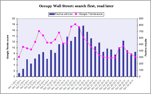
Factiva searches give the volume of news articles by day. Google Trends show the search relevance and volume. Plot them together, and you get an idea of when the public were searching for something, and when the mainstream media wrote about it.
Here’s the chart:
You can see straight away that there is a two day lag between the Factiva news peak and the Google peak, on October 15th for search and October 17th for news.
But there was a previous search peak on Oct 6th that was scored 15.7 by Google, not far below the peak of 18.1. But the Factiva volume at that point was 349, over 50 per cent below the highest single day news volume of 792.
In fact, up to the peak, there is a news lag, shown by the gap between the pink line and the blue bars. After the peak, the blue bars trend higher than the pink line, suggesting that the news media is playing catch-up while searching has tailed off.
Ok, some caveats. Google Trends is good – it made a big deal about how it could predict outbreaks of flu back in 2008. But it’s not everything, and Twitter data might be even more revealing. Ditto Factiva: an excellent source, but if we looked at their blogs results rather than news publications, it would be closer to the google trend line.
But I think it’s an interesting way to see what we are searching for, and writing about – and where the gaps are.


