Rob Minto

Sport, data, ideas

Category: Data (page 2 of 3)

Forget Harry and Amelia – we are naming our kids with more variation than ever

I have a big interest in this one: I am about to be a father for the 4th time. Finding a name is tough when you’ve used up a whole bunch already, and you have to avoid clashes with friends and family with similarly-aged children.

So the Office of National Statistics baby names for 2012 – released on Monday – is a data treasure trove. What’s up, what’s down, what to avoid.

But in all the hoopla over the top names (Harry and Amelia), there is an important trend playing out. In the UK, we are getting far more diverse in how we name our kids.

There are several ways to measure this, using the ONS data that goes back to 1996.

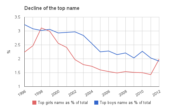
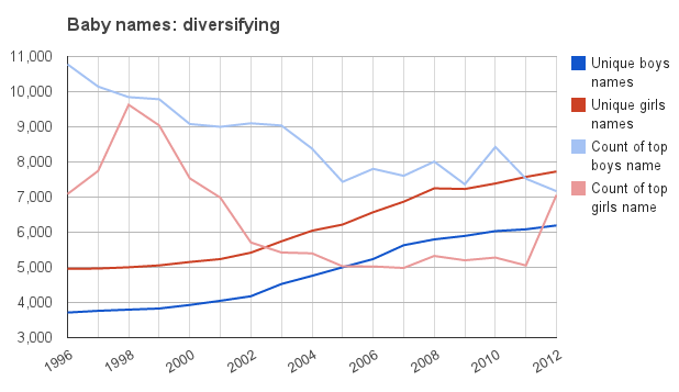
One is to look at the number of babies that are given the top name. From a peak of nearly 11,000 for boys in 1996 (the first year of available data) and 9,600 for girls in 1998, the top name has dropped to around 7,000 for boys, and until 2012, around 5,000 for girls. Ameila, the top name in 2012, has bucked the trend, with around 7,000.

But does that mean that we are simply spreading names out further among the favourites? It seems not. The ONS also lists all names that are given to three or more children in each year. The pool of names that aren’t so weird or odd as to be completely unique is rising, from under 4,000 for boys in 1996 to over 6,000 now; and under 5,000 for girls to nearly 8,000 in the same period.

(The Independent reported that there were 28,000 different boys’ names and over 36,000 different girls’ names in 2012 – which means there are a HUGE mass of names that aren’t listed by ONS which have just one or two occurences. Roughly 28,000 names have one or two occurences – out of 350,000 births, that’s a lot. But I’ve worked from the ONS dataset which gives three or more instances of each name.)

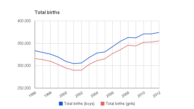
That could be partially explained by simply more overall births – and after a drop to 2002, the birth rate has indeed picked up.

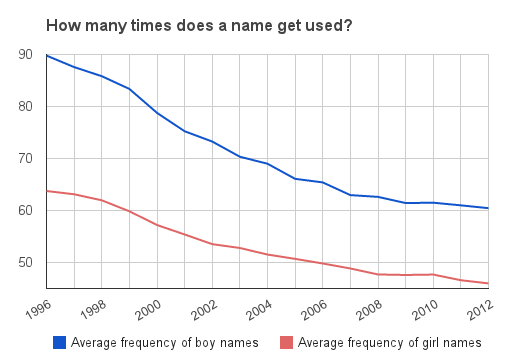
But we can easily factor that in: the average frequency of names for both boys and girls (ie the total births divided by the number of unique names used 3 or more times) is going down consistently over the period.

Equally, we can look at the number of times the top name is used as a percentage of the total births for boys and girls – and this is also heading down, with over 3 per cent of boys being given the top name in 1996, to under 2 per cent now. The girls top name has fluctuated more, but the trend is similar.

The divergence between the results for girls and boys shows that we have always been more creative with girls names – but the diversification trend is happening for both genders.

Why is this happening?

One answer may be immigration. As the UK gets more people from other countries, so it will get a greater diversity of names. This explains the higher number of unique names.

But that doesn’t explain the rapid decline in the number of times the top name is used. That implies we are getting more creative.

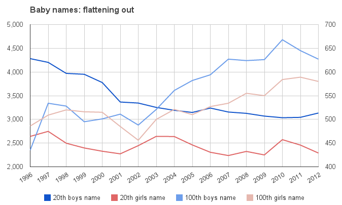
And in fact, if we look at the number of times the 20th name is given, and the 100th, there is an interesting pattern. For both girls and boys, the 20th name is also declining in popularity, but not as dramatically as for the top name. But the 100th name is generally getting more popular over time. That implies we are searching for more interesting names – the 100th most popular name is not exactly mainstream.

How far can this go? For boys, a lot further, clearly, as boys names lag behind girls in terms of diversity. Overall, there may be no end to it. You can imagine almost limitless variations on some names, as well as ever more exotic places and made-up names. Then there are hypenated versions: there were 19 Lilly-somethings alone last year. And there are parents perhaps trying to get their kids noticed by alphabetical means – there are 69 girls names in the 2012 data that start with two As, compared to 17 in 1996. And there were 125 girls names starting with Z in 2012 – compared to 74 in 1996.

Parents want their kids to stand out, it seems.

Data for all charts from ONS
The royal baby: is the US that interested?

Any piece about the interest around the world in the new royal baby, now named as George, invariably asks why the US cares so much about the UK royal family.

But if web searching is any guide, the US is way less interested than we think. Google trends regional results for the search term “royal baby” show that the US is down in 8th place, behind Italy, for relative search volumes in the last week.

The UK is top, as you would expect. But the rest of that top ten I would not have guessed. Some of the Commonwealth countries (Australia, Canada) – maybe. But Ireland, Singapore and Switzerland in the top 10? Nah.

Here’s the chart:

Top regions for “royal baby”  Search volume
United Kingdom 100
New Zealand 68
Ireland 64
Canada 61
Australia 55
South Africa 50
Italy 46
United States 44
Singapore 18
Switzerland 16

Kidnap and piracy: is the world getting safer?

Yes, maybe…

It would be nice to think that the world is a safer place. It certainly wasn’t in 2012 for journalists, who died in record numbers. But in two categories, it looks like the peak may have passed.

Kidnapping and piracy are two very different activities, but both are crimes with (in almost all cases) a very economic motive. In contrast, terrorism and other acts of violence are often ends in themselves. Whereas kidnapping and piracy are purely about money.

So when times are tight, we might expect them to go up – they are fairly drastic measures, although with potentially high rewards.

In recent years, piracy has become a big story, especially in the Gulf of Aden near Somalia, where many incidents have occurred. However, there have been reports recently that piracy is declining – when Somali pirate Mohamed Abdi Hassan called a press conference (yes, a pirate press conference) to say he was retiring earlier this month, that was seen as a watershed moment.

In fact, according to the IMB piracy reports, piracy hasn’t been this low since the 2005-08 period.

What about kidnapping? In the Philippines, there have been reports that in 2012 it has declined. And worldwide, according to the Start database, they are falling too – the data only goes to the end of 2011.

Here’s the chart. It looks like the peak year is 2010. But the 2012 kidnapping figures might change that.

Sources
Kidnapping: http://www.start.umd.edu/
Piracy: http://www.icc-ccs.org/piracy-reporting-centre/piracynewsafigures

Tucker vs Carney: the picture from Google

This is what a surprise looks like:

Background: Mark Carney is appointed Governor of the Bank of England ahead of bookies favourite Paul Tucker.

As the news breaks, you can see Google searches for Mark Carney in the UK shoot up from nowhere.

Goodbye, Feed My Inbox

{UPDATE} see the comment on this article from Feed My Inbox co-founder Nick Francis – in which he explains a lot more about the service (many thanks Nick).
___________

Bread of heaven, bread of heaven
Feed me till I want no more;
Feed me till I want no more.

I was a customer of Feed My Inbox. It did (and for a few weeks more, still does) a useful but unglamourous service, which is take an RSS feed and turn it into email. This was great for sites that either publish now and then, like this blog, or for daily summaries of news. I even had a sign up box on this blog, recommending it.

But the service is closing down. On the homepage, the company says:

After much consideration, we have made the difficult decision to shut down Feed My Inbox over the course of the next couple of months.

Long story short, we failed to generate enough revenue to sustain the business long-term and justify the time necessary for ongoing support, maintenance and feature development.

We wish it turned out differently, but our team learned a great deal over the last 4+ years. Thank you for being a customer.

I don’t know much about the company, but I do know that it was a small outfit – perhaps just four people. I learned this from digging around on Brightwurks, which is the site owner. The company was private, so there aren’t any numbers to digest, but in one blog post the company mentioned 175,000 customers.

What isn’t clear is whether these are paying customers or not. It operated on a freemuim model – the basic service of 5 feeds was free, and then you paid for additional premium features and more feeds, starting at $5 per month.

As far as I can see it, the problem with Feed My Inbox was three-fold.

1a) Freemium doesn’t work unless you have massive scale. Because, unless you provide a killer app, most people will just stick to the free version. And then if someone offers a similar service, you are stuck – it’s hard to change the barriers between services without annoying paying customers, or attracting new ones.

1b) Freemium is a bad model for development. Paying customers fund the growth in non-paying free-riders, with the hope that some of them eventually turn into payers too. Very little of the revenues from paying customers is ploughed back into improving their service.

2) Email is a cluttered mess. There are too many newsletters, bills, updates etc, nevermind all the crap emails that people actually write, nevermind the spam. So adding to all that isn’t particularly appealing to lots of people who are already swamped.

3) Hello social media. Facebook and Twitter are far better places to follow or like stuff you are interested in, making email seem a quaint, antiquated way of getting updates. That’s without considering RSS readers like netvibes or Google Reader.

So that’s it. But you can bow out gracefully, which is the case here.

The Feed My Inbox team have put together a very helpful page of tips on other services and ways to migrate, which I think is above and beyond. Can you imagine a bank doing that? But thanks to them, I am now using blogtrottr.com, and have a sign up form on the blog for that service, and the whole service seems very good.

I just hope it lasts. It’s free.

London mayor race: how Boris was lucky with the missed 2nd preference

Background: Boris Johnson has been re-elected moyor of London for a second term, beating Ken Livingstone by a narrow margin.

Boris Johnson is very lucky to be re-elected. Why? Because the biggest second-preference vote was “no-one”. If voters had used their form to the full, he could have easily lost. Here’s why:

First round votes:

Boris Johnson CON 971,931
Ken Livingstone LAB 889,918
Jenny Jones GRN 98,913
Brian Paddick LD 91,774
Siobhan Benita IND 83,914
Lawrence Webb UKIP 43,274
Carlos Cortiglia BNP 28,751

So, no overall majority, but Boris is ahead. However, count up the non-Boris, non-Ken votes and you have 346,626.

On the second preference votes, Boris won:

First preference votes Second preference votes Total
Boris Johnson 971,931 82,880 1,054,811
Ken Livingstone 889,918 102,355 992,273

But total up the second preference votes distributed – it comes to 185,235. That leaves 161,391 votes left “on the table”. Boris won by 62,538.

If those 161,000 votes had gone 70-30 to Ken, it’s Ken in City Hall. Quite a big ask, but do-able. There were lots of people who voted for the less-likely candidates for first choice, and then either didn’t put an “X” in the box for their second choice, or voted for another minority candidate. Perhaps they didn’t like either Boris or Ken – fair enough, but those 46 per cent have just lost the chance to make a big difference in the outcome of the election.

It shows how courting minority parties – just as Sarkozy and Hollande have had to do in France – can be the difference between winning and losing.


The crazy cost of Switzerland

I’ve just got back from a long weekend in Geneva. Lovely place, beautiful lake, painful exchange rate. Switzerland was always quite expensive, but with the Swiss Franc a safe haven for investors, hanging out in Geneva suddenly looks like a small fortune.

But leave aside the cost of normal stuff like food and hotels for a second. We were staying with friends for part of the trip who live very near the border with France, so I got text messages alerting me to what mobile services would cost from my telco (T-Mobile) in either country.

[easychart type=”vertbar” height=”200″ width=”350″ title=”Mobile prices, price(£)” axis=”both” groupnames=”France, Switzerland” valuenames=”Make call, Receive call, Text, Data per mb, Picture msg” group1values=”0.366, 0.115, 0.115, 0.333, 0.2″ group2values=”1,1,0.4,7.5,0.2″]

And what a difference half a kilometer makes – over in France, it was 36p per call, and 11p to receive a call, compared to £1 in Switzerland. A text in Switzerland was 40p to 11p in France. Weirdly, picture messages were the same on both (20p).

But it was data where the greatest difference lay. In France, I was offered £1 per 3mb. In Switzerland, it was £7.50 for 1mb – over 22 times more expensive.

Now I know that EU regulations are bringing down the cost of call and data roaming in Europe, which Switzerland is free to ignore. And this is a sample of one, rather than a proper survey. But data should never, ever cost 22 times more just by walking 500m across a border.

Big data is underestimating the emerging markets

Consultants and analysts – and bloggers, of course – are keen to tell us how big the world’s data is, and how fast it is growing. We have entered the “zetabyte age”.

But for all the talk of “Big data” and how daunting it all is, I think data levels are going to be far bigger than we estimate now. As far as I can tell, most of the models of data usage look at developed markets, and extrapolate the phenomenal growth in data from use of smartphones, PC usage, companies etc.

But this underestimates the usage of data in the developing world. Many countries are going to run straight through the non-networked, 2G world and join the data-everywhere, cloud-based, streaming world instead. And this has big implications for data.

The EMC Digital Universe infographic (pdf) suggests exabyte growth of the total world data from 1,227 in 2010 to 7,910 in 2015. Although this looks like a huge increase compared to 2005 to 2010, when world data was estimated to go from 130 exabytes to 1,227, the actual rate of growth they predict is slowing, from a factor of 9.4 to 6.4.

Instead, take a look at the McKinsey report into big data (pdf).  On page 103 we can see a rough breakdown of data storage by world region. If we take North America as the target level, that region uses 6.5 petabytes per million people. Run the rest of the world at that level of data usage, and the world total of 6,750 petabytes goes up over 5 times to 37,296 petabytes. See table below.

Now the rest of the world isn’t going to catch the US in the next 5 years in terms of data usage, but you get the idea of the scale of this. China is currently on 0.2 petabytes per million. India is even lower. Working on models of developed countries is fine for now, but the rest of the world will catch up faster, and use far more data. I’d rip up a few of those models and predictions and start again.

Region Petabytes Population (m) (Source: Wolfram Alpha) Petabytes per million people Petabytes assuming North American data usage Percentage change
North America 3,500 538 6.5 3,500 0
Latin America 50 589 0.1 3,832 7,564
Europe 2,000 595 3.4 3,871 94
China 250 1,350 0.2 8,783 3,413
Japan 400 127 3.1 826 107
MENA 200 599 0.3 3,897 1,848
India 50 1,210 0.0 7,872 15,643
Rest of APAC * 300 725 0.4 4,717 1,472
Total:
6,750
Total:
37,296

* Rest of Apac population taken from Wikipedia, with Japan, China (incl HK and Macau) and India removed.

How to live dangerously – a book that does statistics a disservice

Being a statistics junkie, a couple of people recommended to me the book How to live dangerously by Warwick Carins. Normally, I would read it, enjoy, and move on. But this book has prompted a mini-review (several years late, but who cares…), because it commits several statistical crimes.

One is that Cairns plays fast and loose with surveys. Surveys here, surveys there. No mention of how many people asked, by which method, or the sources. We can all cherry pick surveys to prove any point we like. A health warning is needed.

Second, Cairns is too casual to dismiss what we don’t know, and uses little data to back up the main thrust of the argument (which I broadly agree with), peppering his prose with “probably”s and “these days”. Example:

In 1970, eight out of ten elementary schoolchildren used to walk to school. In 2007, less than one out of ten did – and they were probably the ones who lived across the road, or whose dads were the school caretakers. Most children these days are driven to school in cars, even if they live just round the corner.

Really?

Thirdly, and far worse, it actually uses statistics to deceive, rather than prove a point. The worst offence is comparing the data on child abduction and murder with death from fires.

It is clear that the media make more of the former than the latter – a child killed in a fire is a tragedy that is maybe mentioned in the local news, while an abduction and murder will make national headlines quite often.

But Cairns breaks down the stats by pointing out that in any one year, only 100 or so US children are abducted by strangers, and of those 46 are killed. He then extrapolates that to say that the average child has a 0.00007 per cent chance of this fate, which equates to it taking 1.4m years for a stranger to murder your child if you left him or her unguarded on the street.

Obviously the idea of living for 1.4m years is nonsense, and a cunning way of pointing out our ridiculous fear of this event. But then he points out the relative danger of keeping a child indoors and the risk of fire, to show how foolish we are at stopping children going out.

Not citing which country (I assume the US again) he says “one child dies of [fire in the home] every ten days.”

So he sums up our fears thus (from p46):

So, they go out, and face the 1-in-1.4 million chance of being abducted and murdered. Or they stay in, where one child gets burned to death every ten days.

This is the worst statistical argument I have ever come across. Comparing a 1-in-1.4m chance (which is not the same as 1-in-1.4m years anyway) with one-in-10 days sounds like a logical slam dunk – why on earth would we care about the million chance when every 10 days a child dies in a fire? Except that these are far more similar stats than the way they are presented. Actually, using Cairns’ data, one child is abducted and then murdered every 8 days, compared to a death every 10 days in a fire. Or, put it another way, there are 46 abductions and murders every year in the US compared to roughly 37 fire deaths.

Either Cairns is being appallingly deceptive, or incredibly sloppy and can’t understand the stats himself. Either is hard to forgive in a book that tries to cut through the froth and present our fears and risk in a rational way.

Overall – for a book that cites statistics and tries to uncover our irrational fears, it is sloppy, prejudiced and patronising. It is poorly sourced, and although entertaining, lacks rigour. This is an important topic. It’s a shame that it is treated so badly.

The gender timebomb of India and China: a stab at the numbers

When I visited India in 2003, I was shocked by areas of the countryside where there seemed to be not a young girl in sight. It was all boys, as far as you could see.

When we asked our tour guide about the lack of girls, he scoffed at any suggestion of infanticide or selective abortion. Instead, he told us that women could conceive a boy if they slept on a particular side of their body just after intercourse.

This was a man with a degree, a full education and seemingly worldly-wise. He surely couldn’t believe the old-wives tosh, and was just peddling nonsense to avoid reality.

But the population time-bomb in India and China is soon going to be upon us. China pursued a one-child policy that has skewed a generation towards males. India’s gender imbalance is cultural rather than state-imposed, but has a similar effect.

Take India. If the 917 girls to 1000 boys ratio is correct, that means by 2020, we are looking at over 25m (and probably closer to 35m) shortfall in girls to boys in a 15 year generation.

The back-of-envelope maths:
There are 100m plus children aged 0-4. Multiply by 3 for a 15-year generation. 300m * (1-0.914) = 25.4m

In other words, there are going to be, in all likelihood, over 20m young men in India who have no chance of finding a partner.

In China, it’s around the same scale – over 20m young men left out of the dating game. The population data used in the CIA Factbook bears this out:

0-14 years Male Female Difference
India 187,450,635 165,415,758 22,034,877
China 126,634,384 108,463,142 18,171,242

In a generation, we are going to have over 40 million enforced bachelors in India and China. What does this mean for these societies? There are several trends we can expect, as outlined in Bare Branches:

high male-to-female ratios often trigger domestic and international violence. Most violent crime is committed by young unmarried males who lack stable social bonds. Although there is not always a direct cause-and-effect relationship, these surplus men often play a crucial role in making violence prevalent within society. Governments sometimes respond to this problem by enlisting young surplus males in military campaigns and high-risk public works projects. Countries with high male-to-female ratios also tend to develop authoritarian political systems.

In other words:
– rising crime in sex trafficking and prostitution
– social bonds weaken
– riots and disillusionment
– authoritarian crackdown
– high military enrollment

Not a wildly happy future. All those who see India and China as a one-way bet should perhaps think again.

Further reading:

BBC:India’s unwanted girls
Economist: The worldwide war on baby girls
Economist: China’s population – The most surprising demographic crisis
UNFPA: Sex-Ratio Imbalance in Asia: Trends, Consequences and Policy Responses

UPDATE: The economist has a great chart on China’s population and the impact of the one-child policy.

Older posts Newer posts

© 2024 Rob Minto

Theme by Anders NorenUp ↑