Sport, data, ideas

Category: Sport (Page 4 of 24)

The 6 Nations is getting less exciting – according to the scores

A slightly worrisome chart on the BBC this week in the run up to the opening 6 Nations match between England and Wales. It showed the average points difference for each match since 2000, with a big uptick at the end. Higher points difference means one-sided matches, surely? And that isn’t good for nail-biting matches, and crowd entertainment.

Here’s that BBC chart:

But does that tell the whole story? Perhaps not.

Points difference is only one aspect of a game. An open game which ends 40-30 is clearly more exiting than one that ended 15-5. The same ten-point difference doesn’t convey the excitement in the first game.

Clearly total points is also important. But total points alone clearly doesn’t tell the whole story either. 57-3 is hardly as exciting than 33-27.

So ideally, we want high-scoring games with a small points difference. If we take the average total points per game and subtract the points difference, that gives us some idea of excitement, at least from the scoreline. It means a 23-20 game is more exciting than 6-3, as it would score 40 (23+20-3) points compared to 6 (6+3-3).

6Nations-TP-DP

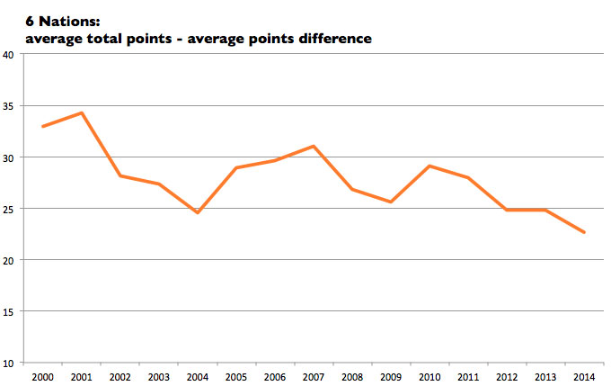
So what does the chart show? The total points scored minus the difference in points (TP-DP) is dropping over the years, and is now at just 22.7 from being over 30 in the first years of the 6 Nations. There was an initial decline, and then with breakdown rule changes, excitement increases to 2007; but then the decline starts again. We want the line on the chart to be trending up, not down.

That’s not good. But what about the Italy effect? Italy, when they were introduced to the 6 Nations, took a few big losses as the team became used to the standard of competition. They lost 80-23 to England in 2001. The 12 times that a team has lost by 40 points or more in the 6 Nations, Italy have been the loser eight times, and most of those were pre-2006.

So let’s take Italy out of the equation. Of the old 5 Nations teams, has it got more or less exciting?

5Nations-TP-DP

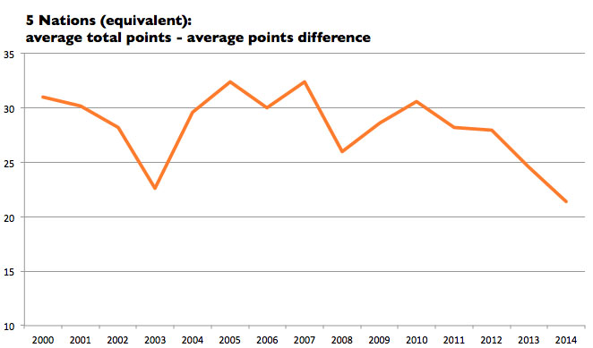
It’s the same pattern, only more pronounced. There is a sharp decline to 2003; an increase to 2007; and then a drop from 2010.

The worrying thing is that we are at a low: it’s 21.4, when several years had TP-DP scores of over 30.

Time for further rule changes? Who knows? Scores only tell you so much: a low-scoring match with a sudden try at the end can still be a gripping game. But then, scores on average will tell us something. If they are anything to go by, the 6 Nations is getting one-sided, and, I hate to say it, a bit dull.

4 things Google Trends tells us about the Super Bowl and the NFL

American Football’s imminent death has been greatly exaggerated – for now, at least. Super Bowl XLIX was the most-watched event in US TV history; and if Google Trends are anything to go by, it was a wildly popular event online too.

Here are a few things that leap out of the data:

1) Controversy sells

Deflategate – the inevitable name for the scandal over the low-pressure balls used in the Patriots’ play-off game – clearly wasn’t a turn off. Domestic abuse scandals from earlier in the season might have been, but for whatever reason, that hasn’t hampered viewing figures.

2) This is a step change in interest

Look at the Google trends data from 2004 to 2014 for the search term “Super Bowl”, worldwide, pre 2015:

google_trends_super_bowl_ww_pre2015

As you would expect, interest – as measured by Google’s collection of Super Bowl related searches – spikes around the time of the big game each year, but going from peak to peak, interest was relatively flat. Searches from 2014 (scoring 100) were a bit higher than 2013 (86), which were down from 2012 and 2011 (92).

Now look at the worldwide chart including the Super Bowl just gone:

google_trends_super_bowl_ww

That’s quite some spike. Unless the data is going to be revised in the next few days, it looks like this year’s Super Bowl was a huge online event.

3) If the NFL is going to set up an overseas team, London shouldn’t be a shoo-in

London got three NFL games this year, and talk of a London NFL franchise has been kicking around for a while. But the NFL does have other options: Canada, Mexico and Germany have all been mentioned at one time or other.

So let’s compare the interest (as measured by Super Bowl searches) in those four locations over the past five years, which is roughly when serious talk of overseas teams started. We can’t drill down just to London, so the UK will have to do as a comparison. (Aside: when you isolate the data to England, the town that comes out top is Altrincham, followed by London. I have no idea why.)

google_trends_super_bowl_4_countries

There’s a big recent spike, but for the recent Super Bowl, the countries score like this: Canada, 100; Mexico, 74; Germany, 38; UK, 19. Where would you go?

4) Brits don’t know if it’s one word or two

Superbowl or Super Bowl? Re-run the chart above with the incorrect one-word spelling, and the UK (with 26) leapfrogs over Germany and Mexico (both on 20). Canada is still top, but overall, Canadians do know it’s two words by a score of 100 to 70. Germans do even better, scoring 100 to 35.

The Brits, however, get it wrong more than they get it right: Google Trends shows “Superbowl” scores 100 in the UK compared to “Super Bowl” with 90. Clearly there’s still a lot of marketing work to do in the UK.

UPDATE: I have amended the Google Trends numbers for the 4 country comparison with the latest data.

Nadal, Berdych and the upper limit of winning streaks

462326540Tomas Berdych must be a relieved man. Having lost 17 times in a row to Rafael Nadal, he has finally snapped the streak at the Australian Open.

Had he lost, it would have been a new record. Tennis rivalries do often produce one-sided periods, but 17 wins for one player in a row is the upper limit. It’s the number of consecutive wins that Bjorn Borg had over Vitas Gerulaitis; that Ivan Lendl had over Tim Mayotte; and Lendl had over, surprisingly, Jimmy Connors.

Weirdly, the upper teens seems to be the limit in other sports streaks too: the Australian cricket team went on a 16-test winning streak in 1999 to 2001. Both New Zealand (twice) and South Africa hold the record of 17 straight test wins in rugby. And Spain’s football team had a 15-game winning run.

Is there a mathematical reason for 15 to 18 being the upper limit of streaks? If it were a coin toss, then probably yes. But sport isn’t a coin toss. The win streaks get harder as teams put pressure on themselves to perform, and opponents look to topple the team of the moment. Of course, it’s easy to give a bad performance, and teams get injuries, or retirements.

The tennis streaks mentioned above have ended at 17 as one of the players retired. The interesting thing about Berdych’s victory is that it is the first reversal. Nadal may have been under par, but the pressure would have been on Berdych to win, rather than in team sports where the pressure piles onto the streak holder.

So which is the next longest active head-to-head winning (or losing) streak? I can’t find a definitive list, but I wouldn’t be surprised if it’s Richard Gasquet against, you guessed it, Nadal. The scoreline is 0-13 in Nadal’s favour.

That quote

As Gerulaitis said after he beat Connors in 1980: “nobody beats Vitas Gerulaitis 17 times”. Except the ATP record shows that his losing streak against Connors was 12, and was 16 against Borg. (There is a walkover for Gerulaitis in 1978, which you might think counts as a win, but the ATP seems to not count them in the head to heads.) I have no idea where the missing 17th match is.

When it comes to FA Cup upsets, size is subjective

462140538

Bradford: biggest shock EVER?

What’s the biggest FA Cup shock defeat ever? For Robbie Fowler, it’s the Chelsea 4-2 loss to Bradford from yesterday (Jan 24). And in terms of drama, it’s clearly a great story. After all, Chelsea were 2-0 up and at home.

But for league placings, it’s not even close. With Chelsea top of the premiership, and Bradford 7th in League 1 (the third tier, despite its name), there are 39 teams between them.

Compare that to the 84 teams between Blackburn and Oxford in 1964, which according to Steve Porter, author of The Giant Killers website is the greatest FA Cup upset ever. Blackburn were 2nd at the time in the top division; Oxford were 18th in league 4.

Porter, who writes under the name Captain Beecher, ranks the upsets in terms of league placings, combined with a player quality metric using internationals and previous cup winners. Porter doesn’t spell out his methodology, but it’s clearly better than just using collective memory and non-scientific lists published in newspapers.

Porter sums up the problem perfectly:

On BBC’s Match of the Day programme, when asking the public if Bradford’s victory over Chelsea was the greatest cupset ever, they showed twelve of what they considered the greatest giant killings of all time. Every game had one thing in common. The BBC TV cameras were there. Not one game which was not covered by the BBC was considered. And so shapes our opinion. If you’re told something was a huge giant killing enough times {7th placed top flight Wimbledon beating Champions, Liverpool 1-0 in 1988. Surprise? yes but giant killing? Really? 7th vs 1st in the Premier League?} You start to accept that it’s true. ITV are a little more impartial, perhaps because they don’t have as much cup footage to be able to make lists exclusively thiers. The problem when compiling such lists is that every time a particular tie is overlooked, it’s chances of being placed in the next TV countdown, or magazine article diminishes.

And where does Porter’s system put Chelsea-Bradford? It’s 15th on his all-time list. Not bad, but it is interesting that it is lower down than non-league Luton’s 1-0 victory over the Premiership’s Norwich only 2 seasons ago, which is in 7th place. That didn’t even make the BBC’s list in the studio analysis. Memories are short, eh?

Being subjective, turning round a 2-goal deficit to 4-2 at Stamford Bridge is an extraordinary result. But perhaps the BBC could, with all its resources, dig up a few proper stats like Porter’s.

See also:
Interactive football league tables

Should Roger Federer keep going?

461996002Roger Federer’s third round loss at the Australian Open will raise the usual questions about this late stage of his career. Should he call it quits now? Has his time passed?

It seems odd to be urging the world’s second best player (by ranking) to retire. The heart says keep on going. The head?

There have been only 11 men in the open era of tennis to win a major in their 30s. Only four (Laver, Rosewall, Connors and Agassi) have done it more than once. For Federer to join that band, he will have to defy not just age, but statistics.

As players enter the later stages of their career, the big wins dry up. So far, the biggest gap in terms of days from penultimate major to last is Arthur Ashe, who took nearly 2,000 days between his 1970 Australian Open and 1975 Wimbledon victory.

Ashe’s gap is something of an oddity. If we look past, Federer is next with nearly 900 days between his 2010 Australian Open and 2012 Wimbledon win. That’s ahead of Sampras (791 days) from Wimbledon 2000 to the US Open 2002. Even Agassi took over 700 days between his final two slam wins in Australia.

For Federer to win another, the gap would be at least 1,000 days by the time we get to the French or Wimbledon in the summer of 2015. Not impossible, but unlikely.

In terms of slams, Federer’s last gap of 10 events is already higher than the gaps Agassi (8) and Sampras (9) posted between penultimate and last wins. If Federer were to win a slam in 2015, it would be 11, 12 or 13 slam events since his last victory – a gap that looks less and less likely to be bridged.

In other words, recent history shows that it just won’t happen. Last hurrahs don’t happen twice – and Federer has already had his.

Gap in days between penultimate and last major titles
(men over 30 in open era)

Ashe 1985
Federer* 889
Sampras 791
Agassi 728
Newcombe 479
Connors 364
Rosewall 354
Laver 65

* For Federer to win another slam, at least 1,064 days will have elapsed.

Gary Neville and the lost art of statistics

What is Gary Neville talking about? He seems to think that defending is a lost art, one that is “never coming back”. End of an era stuff.

To be fair, his column on how defensive training in football is dying is very interesting and is full of insights. However the way he uses statistics to back up his argument is very wide of the mark.

Here’s the key paragraph in full:

If you look at the Premier League goalscoring chart, it bursts into the thousands from 2010 on. There were 942 goals in 2009 and 1052 last season. That’s a huge shift. Once you have a five-year trend of more goals being conceded and more scored it starts to look irreversible. It points to a permanent change in the sport.

Sadly, the Telegraph don’t provide the aforementioned chart. If they did, you would see this *:

To say that it “bursts into the thousands” is very misleading. The 1,000-goals-per-season mark (or 380 game equivalent) has been reached several times in the Premiership before, in 2008, 2004, 2003, 2002, 2000, 1998 and 1993. ** Neville has extrapolated a whole argument from a one season shift from 2009 to 2010.

Back in Neville’s heyday, the 1999-2000 season, there were 1,060 goals scored. And in his first season as a professional, 1992, which coincidentally was the first Premiership season, there were 1,222 goals, which equates to 1,005 goals in a 20-team league.

Never mind getting his own era wrong, Neville looks back further:

perhaps the very bold formations and big scorelines of the 1940s and 50s are what we are heading back to. Maybe attacking football was in hibernation during the 70s, 80s and 90s, when organisation and structure prevailed. Maybe now we are seeing football as it was intended.

So let’s look at the goals per game for the English top flight from 1940 to now ***.

It’s clear from the chart that we have a long way to go before we are at the 3.5-plus goals per game average of the 1950s. It’s just wrong to suggest that is where “we are heading back to” from the data available. Since 1970, there is a very clear goals-per-game level of 2.5 to 2.8. Perhaps we will get up to 3 goals per game – that would be significant. But we are not there yet.

Also, the chart bears no relation to Neville’s assertion that the 1970s, 80s and 90s were a period of attacking hibernation. If so, we are still in hibernation compared to the 1950s.

What we can say with confidence is that the goals-per-season is trending up, slightly. The change from 2009 to 2010 was quite big. But that’s about it.

But why let the real statistics get in the way of a good story? Defending is clearly in the eye of the beholder. Gary Neville was a fine proponent of the art, but his use of numbers is flaky at best.

Statistical notes:

* I have included the goals per game or 380 game equivalent for the current season.

** There were 1,195 goals in 1994 and 1995. The Premiership was initially a 22-team league, changed to 20 teams in 1994-95.

*** Data is from Worldfootball.net

Three managers lose the plot

It must be tough being a Premier League manager. The media are always on you. The fans are after you. Constant spotlight. Huge salary.

Still, there’s no excuse for completely losing the plot. And, in very different ways, that’s what Arsene Wenger, Harry Redknapp and Manuel Pellegrini have just done. Continue reading

Van Gaal’s first five games: where’s the significance?

There’s a lovely moment in the film Moneyball, when Billy Beane (played by Brad Pitt) and his new nerdy assistant are in a meeting with the owner of the Oakland As. Data-cruncher Peter Brand (played by Jonah Hill) tries to point out that the run of poor results isn’t a “big enough sample to be significant” but is quietly shut down by Beane, as he doesn’t want stats talk in front of the owner.

But they were right. The question though, is always a good one. In fact, it’s the key one. Just as important as what data we are using is whether or not the sample is big enough.

In football, the key sample size is usually 38 – that’s a season of 20 teams playing home and away. It’s enough to determine the winner of the Premier League. What isn’t enough is five games.

Take a look at this graphic from the BBC. Ignore the fact that it’s in a column written by the normally insightful Robbie Savage – I’m sure he didn’t approve the graphic, let alone create it. He knows his stuff. His insight into the defence and selection policy of Van Gaal reads well. And Savage likes his stats, but he’s no statistician. This graphic, and the argument that after five games, Van Gaal has a poorer record than Moyes is pretty shabby.

Clearly, the chart suggests that Louis van Gaal is an inferior manager to the dumped David Moyes. Look at all the money! Where are the results? Oh, where to begin?

Firstly, league position after five games is totally meaningless. Teams fly up and down the table with a few results at this stage of the season.

Next, money spent – how is that relevant? Man U have sold players too, but that hasn’t been put into this figure. Same goes for signings. In fact, you could argue that the higher signings should take longer to bed in.

But most importantly, five games is NOT A SIGNIFICANT SAMPLE. There happens to be a run of five games under Moyes where ManU got fewer points than this, at a very similar stage of the season. If you picked premiership games 2 to 6 under Moyes, you get this run of results:

game 2 Drew (Chelsea) 0-0
game 3 Lost (Liverpool) 0-1
game 4 Won (C Palace) 2-0
game 5 Lost (Man City) 1-4
game 6 Lost (WBA) 1-2

That’s a run of five games with just four points! It just happens to be games 2-6 not 1-5.

In fact, there were two other five-game runs of two losses, two draws and a win – ie 5 points – under Moyes during last season.

What happens for the next 20 to 30 games will tell us about van Gaal’s signings and tactics. Five games tells you nothing about Man U, and everything about the journalism.

Pietersen vs Cook: it’s the runs, stupid

Kevin Pietersen’s ejection from the England cricket team is, on one level, extraordinary.

The greatest batting talent of a generation, as many think KP is, has been defenestrated for personal reasons, it seems. The need to rebuild, to move on from the Ashes debacle, meant a scapegoat was needed. KP was an easy target.

Perhaps all that is true. It’s also true that Pietersen’s genius and infuriating ability to get out stupidly has been known for years. Remember this headline: “Dumbslog Millionaire“? That was from 2009.

The truth is, Pietersen simply isn’t as important to England in the test set up as he once was, when it comes to the only thing that matters: scoring runs. In the meantime, captain Alastair Cook has grown in importance, and overtaken him.

To show this, I’ve taken each player and looked at their runs as a percentage of the England total in each innings. Forget averages – they are things like no-outs and by low run chases.

Now of course, that percentage fluctuates wildly. So to smooth it out, I’ve taken a rolling average of 10 innings.

Pietersen from the start of his career was very influential – he was regularly around 15 to 20 per cent of the innings. But that has waned, and apart from a brief spell around 2010-11, including the previous triumphant Ashes in Australia and the successful 2011 home series vs India, his percentage has tended to be below the 15 per cent mark for the second half of his career.

Cook, on the other hand, has seen his importance increase. His peaks over the 15 per cent mark have lasted longer and been more pronounced as his career has gone on, with a recent drop the only blip. His trajectory in terms of run percentage is on the up – KP’s is going down.

This is not something that people tend to measure – cricket watchers use averages, or talk about “important” innings. And those are fine – but they don’t show the relative run-accumulation within the team.

Pietersen is disposable because he isn’t indispensable any more. His runs aren’t any different when you add up the team total, even if gathered in a more exciting way. His sacking may be a huge story – but he won’t be missed nearly as much as some people think. As James Carville might say, “It’s the runs, stupid.”

Who made a worse deal: AB InBev, or Chelsea?

Buying an asset back at a higher price always looks like bad business, whether it’s a company – or a football player.

So which organisation has made a worse deal this week? Giant brewer AB InBev, who bought South Korea’s Oriental Brewery back for $5.8bn? Or Chelsea, who bought Benfica midfielder Nemanja Matic for £21m?

In absolute terms, it’s AB InBev, no question. The company sold OB for $1.8bn in 2009 – so an extra $4bn was needed to get it back.

For Chelsea, Matic was valued at around £5m in a deal in 2011 – so an extra £16m, which is pocket change in this market.

However, in relative terms, Chelsea have lost out more. Matic’s value went up by over 4x in just three years – ie 1.4 times per year, whereas OB’s value roughly tripled in 5 years, going up 0.64 times per year.

Yet in essence, it’s a false question – both the business and the player are different from when they were sold. Another way of looking at it is: what would you need to spend in this market to get something of similar value? When in the summer transfer market Manchester United spent £27m of a rather out-of-sorts Fellaini from Everton, and Arsenal spent £42.5m on Ozil, this doesn’t look like overpaying.

As Andy Brassell said on the BBC: “We should not be too hard on Chelsea for letting him go in the first place, though. His improvement in the last 18 months has been breathtaking.”

« Older posts Newer posts »

© 2025 Rob Minto

Theme by Anders NorenUp ↑