Sport, data, ideas

Category: Media (Page 1 of 2)

How to think about Twitter (in the new Musk era)

There is so much going on with Twitter right now, that there’s no point in trying to summarise. Aside from to say – this is the early stages of the Musk takeover, November 4 2022.

If you want to think critically about Twitter, here are a few pointers.

Twitter punches way above its weight.

The thing about Twitter was never the numbers, but the quality of contributors. You have academics, agencies, politicians, policymakers, journalists, engineers, soldiers, thinkers, all mixing it up. That’s amazing.

But Twitter’s numbers were never that great, whether overall users, revenue, market cap. That was a problem for Twitter as a business. But as a utility, a service, Twitter was everything. Twitter was where the world broke news. This is and was its value. Facebook might have 2.whatever billion users, but had negligible impact in news-making.

Why? Let’s break it down into Content, Tech, Verification (blue ticks), and Advertisers.

CONTENT

One reason is journalists and the media. If Twitter has succeeded in anything, it’s harnessing the mainstream media (MSM). MSM might be ‘bad’, but actually, the MSM is how most people access the news, on whatever platform, even if it’s packaged as social. Social media’s greatest ‘trick’ was to convince the world that the MSM didn’t matter, when in fact, it amplified it, and gave it a bigger voice. I don’t watch GBNews, as I’m not interested in right-wing shitposts dressed up as news. But I’ve seen it on Twitter. Equally, I never tune in to GMB, or Jeremy Vine, but I’ve watched clips loads of times, when people like Owen Jones or Femi are debating some idiot like Ann Widdicombe about immigration or Brexit. It pops up on Twitter.

It’s not linear broadcasting, or traditional MSM. But most articles you see shared, most clips laughed about, are MSM. And if they aren’t, they get verified and amplified by the MSM, who repost them, so around it goes.

But the content isn’t just shared on Twitter – it IS Twitter. People like Trump, Musk, and others who are newsworthy in whatever they say, and say a lot, and say it on Twitter. Obviously, Trump’s gone, but his legacy is that saying X on Twitter, if you are important enough, IS a story. Not part of a story, evidence of X eleswhere, but X itself.

TECH

Rarely mentioned, but really important, is the ease of embedding. Almost all news websites embed tweets as source material. It’s part of the appeal. You can pad out your content easily with a few tweets, as well as doing serious journalism. Other social platforms are far harder in this regard – Facebook makes it very cumbersome. It’s also a function of aspect ratios.

What, you might ask? Well, embed an Insta story, TikTok post, snap or whatever, and it’s designed vertically. If you are embedding into a CMS, that’s annoying – it pushes down your content, tries to fill up the width, and generally looks too big. Tweets, on the other hand, are horizontal. That’s useful – they fit more neatly into the CMS, don’t clutter up, and their design is pretty minimal. Overall, a tweet in a story doesn’t screw up your page load or get in the way of ads. It’s a win-win.

VERIFICATION

Let me talk about ME for a minute. I have a blue tick. It took me a long time to get one. I have applied I think 3 or 4 times in my life. When I was at the FT, I was refused a blue tick as I didn’t use my FT address for Twitter – I preferred by personal address. As an author, I was refused one as I wasn’t part of an ‘organisation’ that Twitter recognised. As a freelance editor, I hadn’t accumulated enough bylined pieces – no name, no cigar. At Newsweek, I have accumulated bylines and – it seems crucially – an author page, so that worked. Boom, blue tick. Do I deserve one? I think so, I’m a sensible person with a public profile who has done some decent work in journalism and publishing over my career. Will I pay $8? Fuck off. I wouldn’t pay $1, once, for a blue tick forever.

The whole blue tick issue has become very toxic. Yes, you can argue it’s feudal. Or managed badly. But the thing Musk gets wrong, so utterly, totally wrong, is that it’s a reputational mark, and by definition you CAN’T BUY REPUTATION. You can improve the criteria, but reputation is nothing if you can pay for it. To make a blue tick (or white tick on blue badge, whatever) an $8 fee, makes the whole idea redundant.

So blue ticks were a good system. Not perfect, but good. They made people aspire to be credible. That’s useful on a platform where anyone can jump in to the debate. It helped Twitter stand out, create authority, which fed back into the small-but-important user base.

ADVERTISERS

Twitter gets revenue from ads. Any ad business is inherently tricky, for two reasons.

1) Ad revenue is pretty much a zero sum game, because ad spend is not exponential. Otherwise, Google wouldn’t have killed newspapers. Everyone is chasing the same ad dollar.

2) While everyone talks about network effects for users, which is how Facebook got to 2.x billion and MySpace didn’t etc, advertisers don’t give a damn. They aren’t locked in to Twitter any more than you are locked in to buying a brand of coffee. Switching is relatively easy. So if Musk allows free-wheeling hate speech to run rampant on Twitter – and he’s just fired half the company, so there’s every chance it will – then advertisers will flee. Suddenly, $44bn looks like a lot of money for a slightly-more intellectual version of Parler or Truth Social.

Social media has had a virtuous circle with the ad business, up until around this year. The next new thing attracted a keen audience; advertisers chase audience, especially hard-to-reach demographics. Ad revenue means investment in product, which makes system more attractive to audience, and round we go.

That revenue is needed to monitor content, because dangerous content can harm: harm people, communities, the environment, democracy. As a libertarian businessman, Musk hate moderation. It’s a black hole, in his view. But it’s key to keep the ‘good’ audience, and advertisers, engaged and happy.

The opposite, vicious circle, is also true. Platforms get stale; audience declines; ad revenues fall, so investment and moderation decline; and the degregation means more people leave (or become dormant). Shares plummet.

Meta is now the 25th most valuable company in America. It’s tanking. There are lots of reasons, which I won’t go in to, but the very fact it’s now below Pepsi is evidence to the fact that Big Tech isn’t a one-way bet. It’s an advertising vehicle, and people don’t like ads that much.

So what’s the answer?

There is no easy answer, in that Musk has control of Twitter, is clearly keen to change it in terms of less interference and more anything-goes; and I predict it will become a useless wasteland in less than a year. Advertisers will disappear, major voices will tire and find somewhere else.

The true value of Twitter was in authority. The fact that serious people used it. In that regard, it should have been protected like a utility, not left to the mercy of an eccentric firebrand billionaire with dubious politics and a penchant for spreading conspiracy theories.

If Twitter fails, what will the impact be?

One thing is that centrist/left voices will be potentially digitally homeless. Something should fill that void, something commercial. But it’s not the be-all.

More important is the public service element of Twitter. A digital, non-profit platform is needed for announcements, public broadcast, probably with no conversation around it, for people to follow as a service. Twitter is amazing in emergencies, for delivering news in the purest sense – not opinion, but up-to-the-minute facts. Where does that go without Twitter? We are left scrabbling around on a myriad of disparate websites.

And that’s where I’ll leave it.

I’m going to post this on Twitter, and then I may never post anything again. We’ll see.
Jordan Peterson bandwagon: a media product

I don’t write to praise Jordan Peterson, nor to bury him. In fact, I don’t care about him at all. What I’m interested in is why everyone else is interested in him.

Lots of articles have been written about Jordan Peterson. If you haven’t heard of him yet, consider yourself lucky: he’s a one-man Baader-Meinhof phenomenon. You’ll see him everywhere now. Outside of the usual suspects of Trump and Megan Markle, he’s possibly the most-profiled figure of the last year, certainly of 2018.

His opinions aren’t important here. Sure, he’s got stuff to say that seems highly relevant in the current cultural climate. He opines on transgenderism, gender pay gaps, free speech, feckless male youth. He’s like a human Rorschach test – you can see whatever you want in Peterson. He’s a feisty Canadian professor fighting battles on campus, a self-help guru, a fraud, a clinical psychologist, an intellectual, an alt-right darling, a free-speech muscle-for-hire. Take your pick.

(The other thing to note is that Peterson has one key skill. Like Malcolm Gladwell, he makes the reader or listener feel cleverer, as if they are in on a secret. It’s the opposite of patronising. It might be superficial, or bogus – or insightful and brilliant. I don’t care. It’s very effective. )

He isn’t necessarily the “Intellectual we deserve“, as Current Affairs put it – he’s the intellectual we currently want.

Or he’s the intellectual we think we want. Or, perhaps, the intellectual the media think we want. I’ll show you how.

How curious about Jordan Peterson are we, and how has it changed? Let’s see what Google has to say:

Source: Google Trends

Worldwide, there’s been a big late January / early February Peterson interest spike. I’ll discuss why later.

And how many Twitter followers has Peterson had over time?

Source: Socialblade

Same again – late January he gains a lot of followers.

Is our interested piqued by the media, or do the media follow what we search? Here’s how many times he’s been mentioned in the press over the last year.

Source: Factiva

Again, 2018 is a big leap in articles mentioning Peterson. Crucially though, the spike here predates the online interest. There were 300+ mentions in November, way more than any other month, although January and March are second and third (with 225 and 198).

It all adds up for Peterson. Here are his book sales for 12 Rules for Life.

Source: Novelrank

Book sales in March catch up after the interest online and articles. (That’s not a surprise.)

In the charts above there is a clear spike. And that is one of the key moments of 2018, in late January. This is the date of the (in)famous Channel 4 interview with Cathy Newman. It’s been watched 9 million times. That’s a lot for a head-to-head.

The interview has been described in very unfavourable terms for Newman. Her questioning was, I agree, poor. But it has become more than an interview: it is now a rallying cry for those who see the media as biased; it gained Newman horrendous criticism and attacks; and it has been dissected to the nth degree, far further than it merited.

It also is a catalyst for Peterson interest. Without that interview, would we have had the flurry of articles, the profiles in the Telegraph, BBC and Guardian among so many others? The key thing to note here is that although the bigger profile pieces have come recently, the highest point in terms of article mentions was in November.

Peterson’s popularity has been talked of in viral terms. The data would suggest otherwise – the media articles came first, and the online spike in interest is clearly after the C4 Newman interview. He is a product of a traditional media bandwagon, not an online phenomenon.

I believe this is a case of filling a vacuum. Politics has become ever more polarised, distrust of media is high and rising, and there is a dearth of public intellectuals. We are crying out for this stuff. It’s intoxicating. But the media spotted it first, not the other way around.


The 10 best sports graphics and data visualisations of 2016

It’s year-end journalism time! My non-scientific round up for 2016 of the best sports graphics… drum roll please.

THE WINNERS (I couldn’t decide between them)

The Sumo Matchup Centuries In The Making
By Benjamin Morris
Publisher: FiveThirtyEight
A beautiful history of Sumo wrestling. Stunning photos, great charts – this is a model of modern data journalism coupled with great writing and presentation.

The NFL Draft
By Tim Meko, Denise Lu, Bonnie Berkowitz and Lazaro Gamio
Publisher: Washington Post
The NFL draft is a whole sport in itself: some teams play it far better than others. The WashPo nails a mix of interactivity, user input (pick your team), long-scrolling with story-telling to amazing effect. It’s not a “beautiful” graphic, but instead a whole application delivered brilliantly. Quite amazing.

AND EIGHT GREAT OTHERS

Premier League 2015-16 – the story of the season
By Neil Richards
Publisher / Platform: Tableau
Not mobile-friendly, but a great way to replay the 2014-15 season. Interactivity that’s integral rather than gimmicky. And it even has managerial sackings!
Notable mention: see also the FT’s rise of Leicester.

Perfect, Freaky Olympic Bodies
By Joshua Robinson, Paolo Uggetti, Siemond Chan and Mike Sudal
Publisher: Wall Street Journal
One of a great crop of Olympic graphics this year, this had no interactivity at all – just a very arresting set of images delivered with great style, looking at some extreme types of Olympic physique.

How Nafissatou Thiam beat the odds to claim the heptathlon gold in Rio
By Niko Kommenda, Apple Chan Fardel and Monica Ulmanu
Publisher: The Guardian
A lovely interactive graphic, coupled with photos and a great story to show how the heptathlon was won. Thiam needed the performance of a lifetime to steal the crown from the favourite. A good example of clean graphics enhance what would otherwise have been a great story in any case.

A visual history of women’s tennis
By John Burn-Murdoch
Publisher: Financial Times
This is how to do sports history. Brilliant. (Disclaimer: I’m a colleague and friend. But this is really good).
Notable mention: The LA Times on Serena Williams – a visual tour of her greatness.

Every shot Kobe Bryant ever took. All 30,699 of them
By Joe Fox, Ryan Menezes and Armand Emamdjomeh
Publisher: LA Times
Weirdly compelling, slightly unnecessary but fantastic all the same. Title says it all.
See also: Stephen Curry’s 3-Point Record in Context by the NYTimes

The current All Blacks are the most dominant rugby side ever. Why?
By James Tozer
Publisher: The Economist
Not visually arresting like others in this list, but a great statistical take on the All Blacks’ rugby dominance, and it has one chart that says it all.

A Visual History of Which Countries Have Dominated the Summer Olympics
By Gregor Aisch and Larry Buchanan
Publisher: New York Times
No list would be complete without something from the NYT, and this is a great visual history. Charts that you will just love. Brilliant. See also: the interactive medal chart. Accept no others.

There were some other great NYT graphics on Phelps and sprinting, for instance. But sticking with my rule of one per publisher, the last-but-not-least spot goes to…

Most Unlikely Comebacks: Using Historical Data To Rank Statistically Improbable Wins (in the NBA)
Publisher: Polygraph
This is just so well done, I love it. I just think you should see it.

So there it is folks. The best of 2016, completely subjective, as compiled by me. You may have your own favourites that I’ve missed, so please add in the comments. But there’s nothing at stake here, just great data journalism to enjoy.

Winners will (probably) get a copy of my book – I know, I know. But it is worth a read.

Squawka podcast: Sports Geek interview

Check out the latest Squawka podcast via audioboom. Worth a full listen, but I’m on around 28 minutes in.

INFO:

Ozil? De Bruyne? Coutinho? Eriksen? The level of playmakers in England’s top division has skyrocketed over the past few seasons and Nic English is joined by Muhammad Butt, Squawka Dave and James McManus to discuss exactly who is top dog.

There’s also time for a very special interview with Rob Minto – author of Sports Geek – to discuss some of the myths in sport and why he’s on a mission to debunk them.

Who didn’t get the memo about Flo Jo?

Uncanny timing laced with irony. A few weeks ago, as Maria Sharapova was ditched by various sponsors for taking a banned performance-enhancing drug, various adverts appeared from Chinese electronics giant Huawei featuring no less than Florence Griffith Joiner.

Yes, Flo Jo. Still the women’s 100m and 200m record holder, who died nearly 20 years ago, and for whom drug taking was never proven, but is widely accepted. The ads are still running in places such as the FT,  Wall St Journal, CNN and the Economist.

There’s some very tenuous blurb to draw a link between Flo Jo’s running philosophy and Huawei. Here’s how it goes:

Florence Griffith Joyner – smiling as she crosses the finish line. She set the women’s world record for the fastest 100-meter dash nearly thirty years ago, a record that hasn’t been broken since. The 100-meter dash only lasts for about 10 seconds. Joyner once said that runners mentally split each second into 100 units, exerting a massive amount of effort to increase their speed by one tiny unit at a time. An improvement of 0.01, although seemingly small, is a huge accomplishment.Huawei’s people have persevered through decades of hard work, relentlessly pursuing the technological breakthroughs that will usher in our future information society.

Combined with this useless copy is possibly the weirdest picture of Flo Jo that you could create. It looks like a 6-year-old was given free rein with Microsoft Paint, rather than anything a professional designer could come up with.

Flo Jo, in a picture that never happened.

While the Chinese have a history of drug-taking athletes, especially in swimming, one of their biggest companies can’t actually want to be associated with this kind of reputation, can it? Flo Jo is one of the stupidest choices you can imagine. There are plenty of clean athletes that Huawei could have picked. Flo Jo is still the record holder, but that’s NOT a good recommendation. Most of the women’s world records from 1988 – the year before out of competition testing started – are tainted.

Wasn’t there a meeting? Didn’t someone do a quick Google search and point out the rumours? Didn’t someone say “drugs”?

You might think so, given that in on version of the campaign, readers can leave comments. Aside from some racist crap, one commenter said:

FGJ is not such a good icon for your campaign, she was not making her world record on bread and peanutbutter alone….

Another put it more succinctly:

Didn’t. Flo jo die at 38 after a lifetime abusing performance enhancing drugs?

Quite. This is possibly the worst campaign you could come up with. Every element is bad. Perhaps Maria Sharapova should give Huawei a call.

When it comes to FA Cup upsets, size is subjective

462140538

Bradford: biggest shock EVER?

What’s the biggest FA Cup shock defeat ever? For Robbie Fowler, it’s the Chelsea 4-2 loss to Bradford from yesterday (Jan 24). And in terms of drama, it’s clearly a great story. After all, Chelsea were 2-0 up and at home.

But for league placings, it’s not even close. With Chelsea top of the premiership, and Bradford 7th in League 1 (the third tier, despite its name), there are 39 teams between them.

Compare that to the 84 teams between Blackburn and Oxford in 1964, which according to Steve Porter, author of The Giant Killers website is the greatest FA Cup upset ever. Blackburn were 2nd at the time in the top division; Oxford were 18th in league 4.

Porter, who writes under the name Captain Beecher, ranks the upsets in terms of league placings, combined with a player quality metric using internationals and previous cup winners. Porter doesn’t spell out his methodology, but it’s clearly better than just using collective memory and non-scientific lists published in newspapers.

Porter sums up the problem perfectly:

On BBC’s Match of the Day programme, when asking the public if Bradford’s victory over Chelsea was the greatest cupset ever, they showed twelve of what they considered the greatest giant killings of all time. Every game had one thing in common. The BBC TV cameras were there. Not one game which was not covered by the BBC was considered. And so shapes our opinion. If you’re told something was a huge giant killing enough times {7th placed top flight Wimbledon beating Champions, Liverpool 1-0 in 1988. Surprise? yes but giant killing? Really? 7th vs 1st in the Premier League?} You start to accept that it’s true. ITV are a little more impartial, perhaps because they don’t have as much cup footage to be able to make lists exclusively thiers. The problem when compiling such lists is that every time a particular tie is overlooked, it’s chances of being placed in the next TV countdown, or magazine article diminishes.

And where does Porter’s system put Chelsea-Bradford? It’s 15th on his all-time list. Not bad, but it is interesting that it is lower down than non-league Luton’s 1-0 victory over the Premiership’s Norwich only 2 seasons ago, which is in 7th place. That didn’t even make the BBC’s list in the studio analysis. Memories are short, eh?

Being subjective, turning round a 2-goal deficit to 4-2 at Stamford Bridge is an extraordinary result. But perhaps the BBC could, with all its resources, dig up a few proper stats like Porter’s.

See also:
Interactive football league tables

The royal baby: is the US that interested?

Any piece about the interest around the world in the new royal baby, now named as George, invariably asks why the US cares so much about the UK royal family.

But if web searching is any guide, the US is way less interested than we think. Google trends regional results for the search term “royal baby” show that the US is down in 8th place, behind Italy, for relative search volumes in the last week.

The UK is top, as you would expect. But the rest of that top ten I would not have guessed. Some of the Commonwealth countries (Australia, Canada) – maybe. But Ireland, Singapore and Switzerland in the top 10? Nah.

Here’s the chart:

Top regions for “royal baby”  Search volume
United Kingdom 100
New Zealand 68
Ireland 64
Canada 61
Australia 55
South Africa 50
Italy 46
United States 44
Singapore 18
Switzerland 16

How do you do a headline about Korea?

The subeditor’s craft is a tricky one. Original headlines are hard to come by. Some are so obvious and clichéd that they are banned in style guides – at my old employer Euromoney, using the phrase “banking on success” was almost a sackable offence.

And yet there is something of a lack of imagination doing the rounds regarding North Korea. Let’s see”

a) the country is a problem – rockets, nuclear worries, terrible regime etc
b) it rhymes with “Maria”
c) everyone remembers the Sound of Music

Result?

“How do you solve a problem like Korea” 

Used by?

It’s not UK-only either. See Time, and Global Post. And that’s just from a few quick Google searches. There will be countless others (41,600 results as of today).

It’s not every headline that is shared by the Sun and the Economist, but this one is such a classic, it spans every type of publication. I bet we haven’t seen the last of it.

Occupy Wall Street: how quick were the media on the uptake?

The Occupy Wall Street movement is spreading and sprawling, into different countries and encompassing many issues.

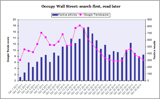
But how fast did it take for the news media to catch on? This is possible to quantify using two things – Factiva to show the volume of news, and Google Trends to show how people are searching.

Factiva searches give the volume of news articles by day. Google Trends show the search relevance and volume. Plot them together, and you get an idea of when the public were searching for something, and when the mainstream media wrote about it.

Here’s the chart:

You can see straight away that there is a two day lag between the Factiva news peak and the Google peak, on October 15th for search and October 17th for news.

But there was a previous search peak on Oct 6th that was scored 15.7 by Google, not far below the peak of 18.1. But the Factiva volume at that point was 349, over 50 per cent below the highest single day news volume of 792.

In fact, up to the peak, there is a news lag, shown by the gap between the pink line and the blue bars. After the peak, the blue bars trend higher than the pink line, suggesting that the news media is playing catch-up while searching has tailed off.

Ok, some caveats. Google Trends is good – it made a big deal about how it could predict outbreaks of flu back in 2008. But it’s not everything, and Twitter data might be even more revealing. Ditto Factiva: an excellent source, but if we looked at their blogs results rather than news publications, it would be closer to the google trend line.

But I think it’s an interesting way to see what we are searching for, and writing about – and where the gaps are.

« Older posts

© 2024 Rob Minto

Theme by Anders NorenUp ↑